Typography is undoubtedly a major player in all sorts of designs, web, print and other projects. The choice of font depends on number of factors viz is the project for a corporate client or a agency, project display, font scalability, type of audience, web safe fonts, kind of approach you want to give (contemporary, vintage, minimal or retro) and many more besides personal choice.
That may be the reason some fonts are used more than others in spite of tonnes of fonts releasing every day. Today’s article is focused on once such typeface, Futura.
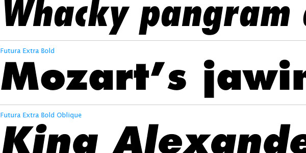
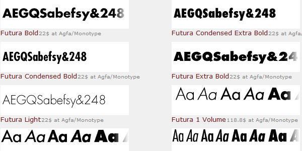
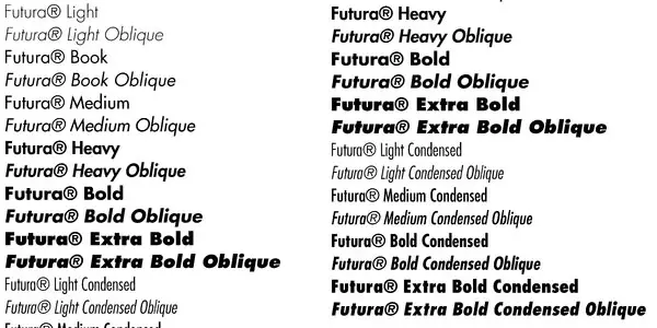
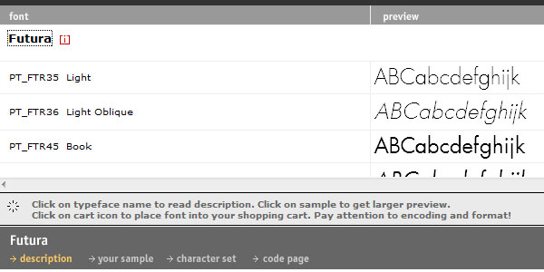
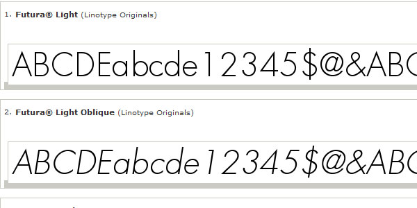
Futura is a geometric sans-serif typeface designed in 1927 by Paul Renner. It is based on geometric shapes that became representative visual elements of the Bauhaus design style of 1919–1933. Commissioned by the Bauer Type Foundry, in reaction to Ludwig & Mayer’s seminal Erbar of 1922, Futura was commercially released in 1927. Source Wikipedia. Even after sixty years of release, Futura’s fever has not faded yet. If you a self acclaimed Pizza lover, you must have noticed the use of Futura Condensed Extra Bold on Domino’s Pizza and for all those like to buy sensibly from Best Buy, Have you ever noticed that the logo is created using Futura Extra Bold.
If you like this article, you might be interested in some of our older articles on Typewriter Font, Script Fonts, All About Helvetica Font, and Calligraphy Fonts.
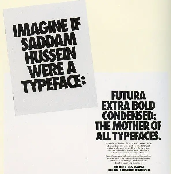
Futura gained huge popularity after a commemorative plaque written in Futura was left on the moon in year 1969. But by 90s it also had to face a movement known as Art Directors Against Futura Extra Bold Condensed” that relinquished excessive use of Futura Extra Bold Condensed.
Trends come and go. Nothing is permanent. We may again start seeing use of Futura font in advertisements and projects again. This post is not about condemning the use of Futura and we are not even encouraging its use, its more of a matter or choice of designers and some times even clients and we just want to provide you some sources from where you can fetch this Font.
Get Futura Font From Here
Fontseek.com
More Information on Commercial Futura fonts
Myfonts.com
More Information on Futura
Fonts.com
More Information on Futura Complete Family Pack










Wow. Nice brief about Futura font. This is my first time to hear (read) that word.
The font looks good for headers and in news galleries.
I agree Satya. The Futura Extra Bold would look great on blog headers and websites too.
Brief info about futura. Liked the font, agree with satya that this font will look good as headers.
I like this kind of fonts. It has the simplistic approach but have the appeal to grab the attention of the viewers.