
The orange color, lying between red and yellow in the visible spectrum, is a color associated with joy and energy. Being the offspring of the two colors mentioned above, it displays the traits of both. Orange is a bright, vibrant hue which can be easily noticed from a distance. That is why it is used as a sign to warn or alert the people. For example, the safety jackets are orange in color. The construction sites also display it to avoid mishaps. In Indian culture, saffron is revered due to its religious significance. Since, it also exudes positivity, energy and optimism; communication mediums use it extensively.
Orange websites are one such example. Displaying warmth and happiness, they entice the viewers and leave a joyful impression on their minds. When used with its complementary pair azure or a contrast color it looks all the more appealing. The details and images added with it get a spicy flavor and the site automatically becomes sunny, no matter how less the presence of orange. It can take away all the blandness and deficiencies of other elements on the site. Isn‘t it great? Today, we bring for you a gallery of 30 orange websites. Enjoy the feast.
Get Concentrating
The theme of the website is completely in sync with orange color which attracts instant attention.

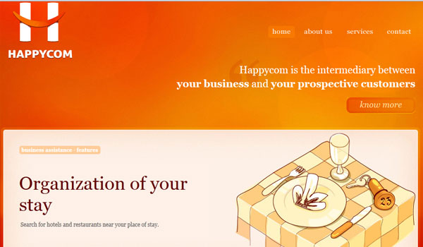
Happycom
Orange at the top of the site with white logo pasted over it catches the eye as soon as one reaches the site.
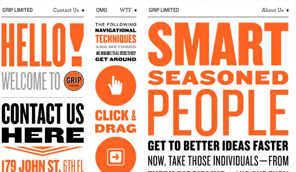
Grip Limited
Orange typography pasted on a white backdrop and mixed with black impart an attractive ambience to the site and make good the absence of pictures.
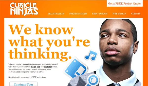
Cubicle Ninjas
Another website using white and orange with the latter in twin shades bearing the all important tagline.
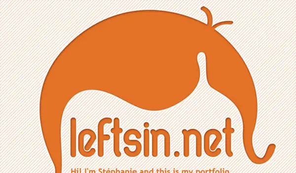
Leftsin
A quaint and intelligent website design employing orange and white has a unique look.
Leftsin
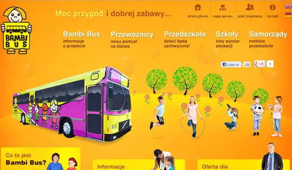
Bambi Bus
An alive looking place that becomes more animated due to the orange backdrop.
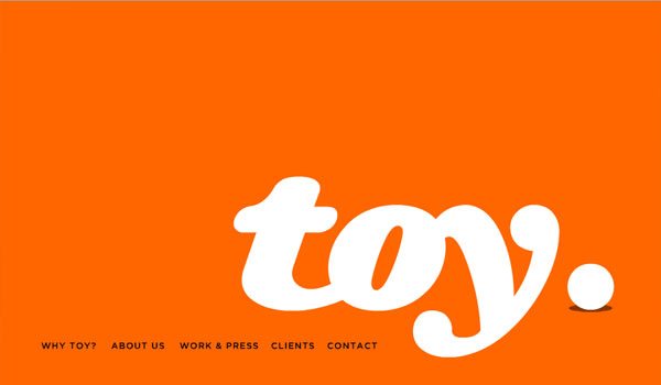
Toy
Completely bright orange backdrop with a large, white “toy” over it and categories in black at the bottom.
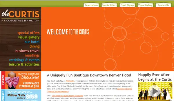
The Curtis
Orange shares the largest share of the website pie with white rings embossed over it.
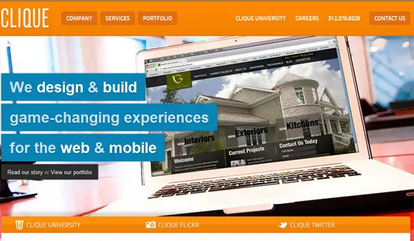
Clique
A brilliant use of the complementary blue with orange to highlight the USP of the company, which makes it appear brighter.
Big Lux Design
Orange and black forming a frame around the routing window highlight the center.

Justinbird
A cool backdrop with the sunrays motif and a blue bird on a white tree looks enticing and one cannot take off one’s eyes easily from here.

Colour Pixel
Another alluring website design with multiple colors but again orange takes the cake, here too.
![]()
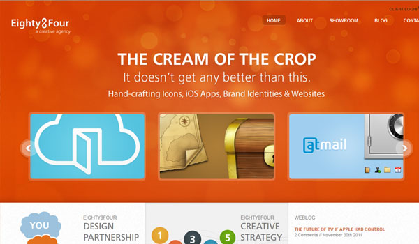
Eighty Four
This one is an elegant orange website with light shades of white and blue used on the slightly glossy backdrop.
Curbside
An individual’s website with his image and white and grey typography applied on a yellowish orange designer backdrop.

Curbside
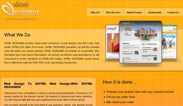
XHTML Designer
A smooth orange background when mixed with black typographic description creates an excellent effect.
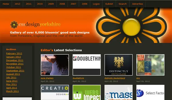
CSS Design Yorkshire
A small dash of orange can also create wonders and it is conspicuous among the colorful collage.
Seegnage
This creative website has an orange top with a figure created inside it that serves as the logo.
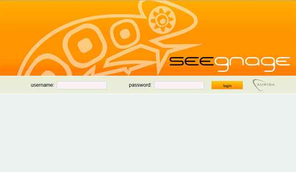
Seegnage
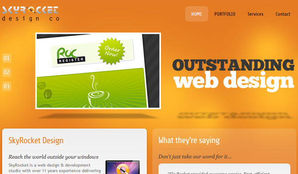
Skyrocket
Minimalistic typography and single image pasted on an orange base have a sophisticated look.
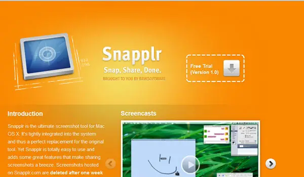
Sbapplr
White typography and blue image together on an orange background serve as the best combination.
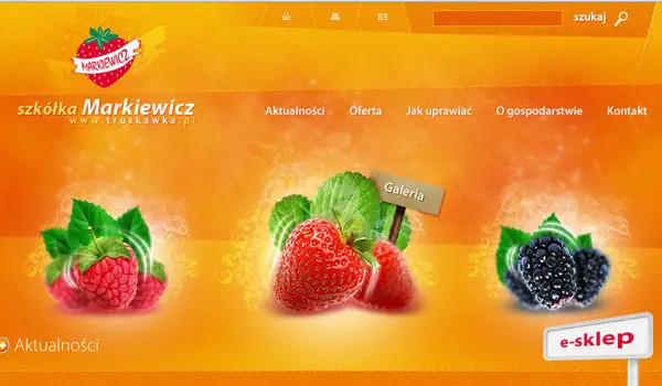
Markiewicz
The red cherries and the orange backdrop have a delicious, mouth-watering look and the website looks tasty.
Acmikan
The Japanese sports website with white and grey typography uses the orange backdrop to convey the spirit and energy of games.

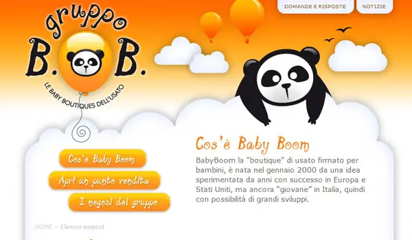
Gruppo
The teddy bear image on an orange, white and black background results in a cute and sweet look for the site related to babies.
Abrigo
The orange wall of the site with sunrays motif and a tag at the center with various images has a distinct display.

Elkind
Orange borders around white on the site of a creative designer have a neat, classic look.

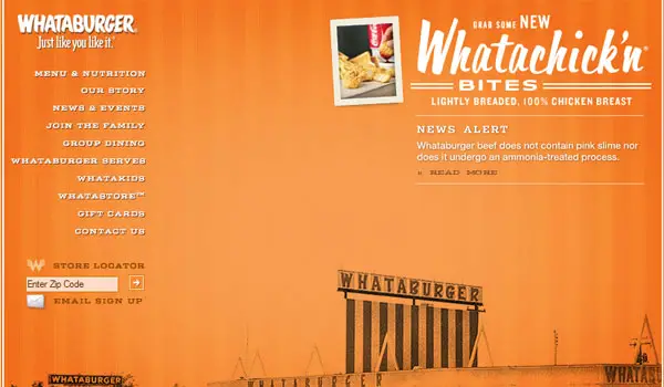
Whataburger
The neat look of the orange website is due to the wide space between white typography on left and right and black imagery below.
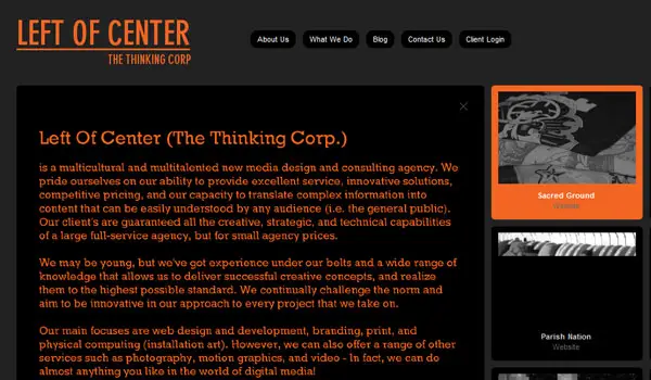
Life Of Center
Orange typography used through the black backdrop on the website to explain about the organisation.
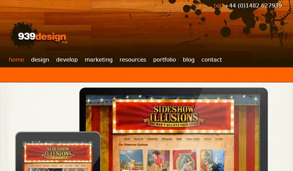
939 Design
Orange used as a highlighter to underline the categories so that the viewer sails through the site conveniently.
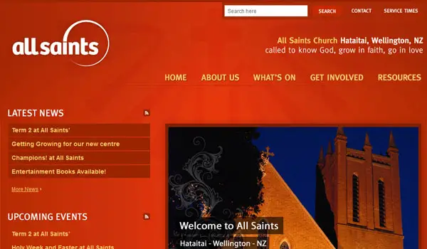
All Saints
The salmon backdrop with a majestic image on corner and well-structured anatomy has a royal look.
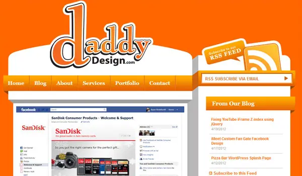
Daddy Design
The website looks like as though two white building blocks have emerged against an orange sky.
Zipper
The website uses orange in the form of a cute logo, the information block below and company name conveying its importance.


Few designs are eye irritating but others used very well. thumbs up
Orange, Purple, Pink are types of colors that designers are hesitant to go with their design. But hats off to creativity of these skilled designers. The websites are marvelous.
I agree with you. It’s not the normal color every one use. It might be hard to blend with others or it’s just that it’s hard to design out of these colors.
Some juicy-looking website designs here. But I will not consider “Grip Limited” and “Life Of Center” as part of it since it only uses orange typography. I mean, for me, doesn’t look like orange. I’m a little weird, right? :))
I would definitely agree. Blue, black and grey with any combination in between are all heavily overused as primary colours. Orange is very nice. And that has nothing to do with the fact that my site is Orange. *cough*
http://www.agenciaarrows.com.br nice orange combination!
Yeah you’re right! Orange is a power color. It also stimulates enthusiasm and creativity. And I love to see if how minimalist website templates design looks like with a color orange as a motif.
That would be a great challenge to all professional web designers if that would be happen. Minimalist design + orange web design = Challenge.
Some of these websites looks great. I love the color and the showcase is quite cool.
Use of bright colors in web design needs a creative mind , and this showcase proves that …
On a side note , the following link is broken – http://www.aurigaspa.com/seegnage/content/index.php
I also liked some of these website’s here…and the color and showcase is quite furious also..
Bambi bus is the one that i like the most in this list. Beautiful list of beautiful designs
Orange, also a color of confidence a definite plus for a business!
orange is very beautiful color and these are very creative designs.
The designs really are stunning. I like the grip limited design. Really nice.
Awesome collection, although some are not the nice websites around, but will do ;) Thanks for the list, good inspiration
These are great designs. I think it‘s the elegant design coupled with the orange color which makes the website look great.
Love this collection. Colors are always a big inspiration and I like using them for my projects.
The color Orange has been used creatively in the showcased web designs. One of the Fascinating collections.
Every design is very creative. And the color does play important role in website look.
All the orange color websites looks very cool to me.
Great collection indeed! It seems like each designer of these websites has discovered a personal orange shade to associate with the idea of the site.
ll the orange color websites are good looking one . i like the CSS Design Yorkshire websites design.
Eye catching picks. Very inspiring. Thanks for sharing.