Many said that designing a website takes up quite an amount of time, this is because we would want our design to look different, one that can stand out of the crowd and one that will grab the viewer’s attention. This is why sometimes incorporating a basic shape, such as a circle or circular elements can make quite a bit of difference in your web design. A circle or circular elements might be too basic for some, but with the right amount of tweaking and design one can be surprised by what this basic shape can do to your design.
For one, the main reason we design our web page is to appeal to the audience, circular elements or circles are commonly associated with communication, the roundness is often link to completeness; and therefore one can use the circle to bring out the message of mutual understanding. A circle also has no edge; therefore the circular element is a simple design that acts as a balance for viewing purposes. By implementing circular elements in your web design, you strive to take a break from standard websites, take note that the web page is already displayed in a rectangular box (your monitor), therefore using circular elements will indeed act as a balance, allowing your web page to look elegant but not too formal.
These reasons alone might give you the idea to incorporate circular elements in your web design; and there are many ways one adopt circular elements in their web design. However, take note that circular elements does not necessarily mean making use of a full circle, it just means making use of the round elements that mimics the shape of the circle. Some prefer to adopt the design by using only minimal circular elements or slipping the design in a subtle form so as to attract too much the attention of the viewers, using these elements on their logos or menu navigation buttons. The circular elements in these examples act more as a balance to the web page design. Next, let’s look at some examples of circular elements in web design.
If you like this article, you might be interested in some of our other articles on Web Designers Websites, eCommerce Websites, Top Website Design Galleries, and Examples of CSS In Background.
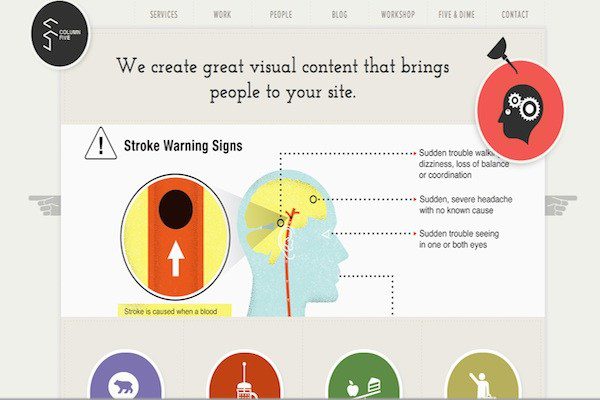
Column Five
More Information on Column Five
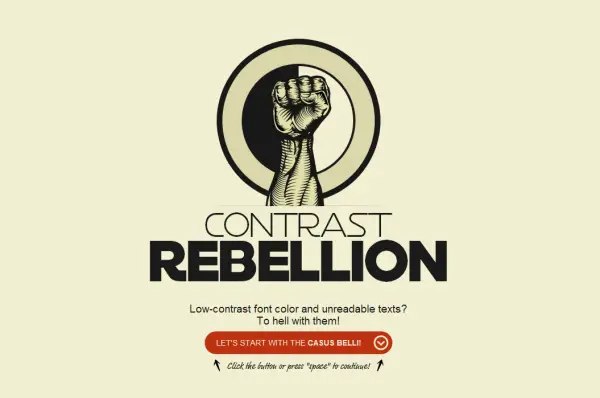
Contrast Rebellion
More Information on Contrast Rebellion
nGen Works
More Information on nGen Works
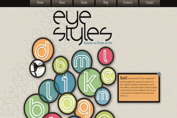
Eye Styles
More Information on Eye Styles
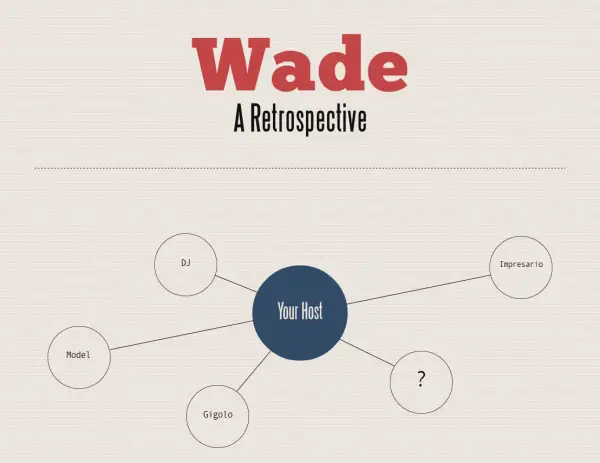
Wade
Pistachio Sketching App
More Information on Pistachio Sketching App
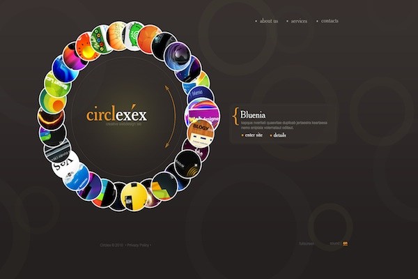
Creative Web Design template
More Information on Creative Web Design template
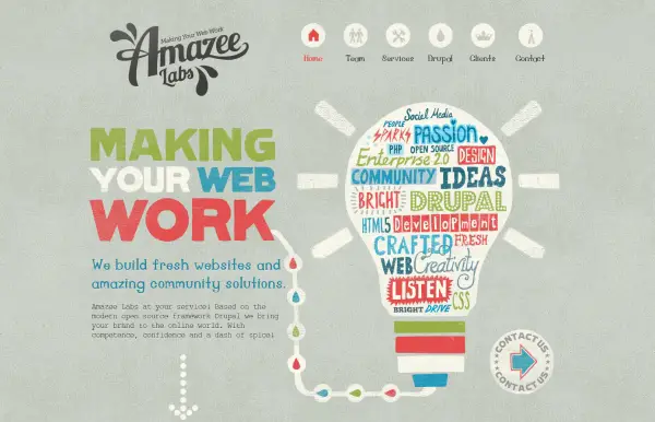
Amazee Labs
More Information on Amazee Labs
Awesome
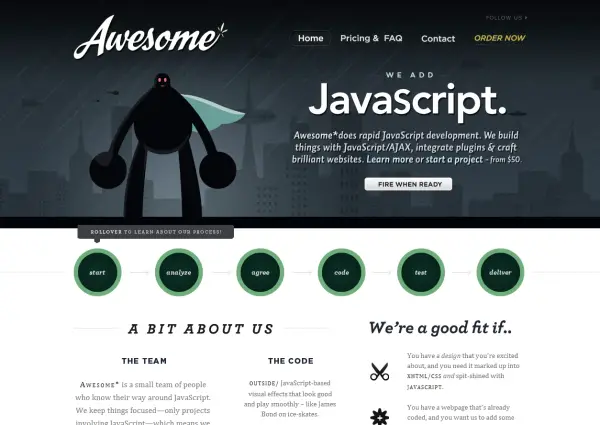
More Information on Awesome
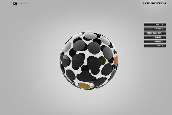
Symbiotech Website Template
More Information on Symbiotech Website Template
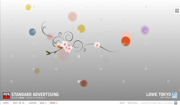
Standard Advertising
More Information on Standard Advertising
Dotmick
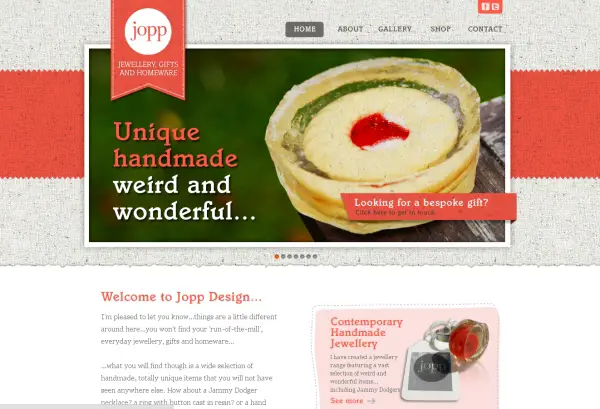
Jopp
Site Optimizer
More Information on Site Optimizer
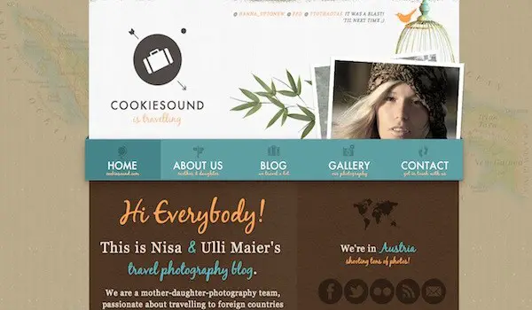
Cookiesound
More Information on Cookiesound
DJ MoSoul
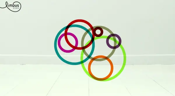
Limbus Studio
More Information on Limbus Studio
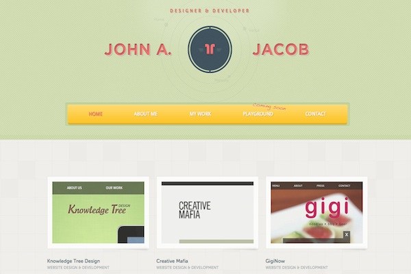
John A. Jacob
More Information on John A. Jacob
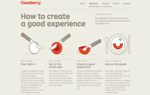
Cloudberry
More Information on Cloudberry
Computer Graphics Design
More Information on Computer Graphics Design
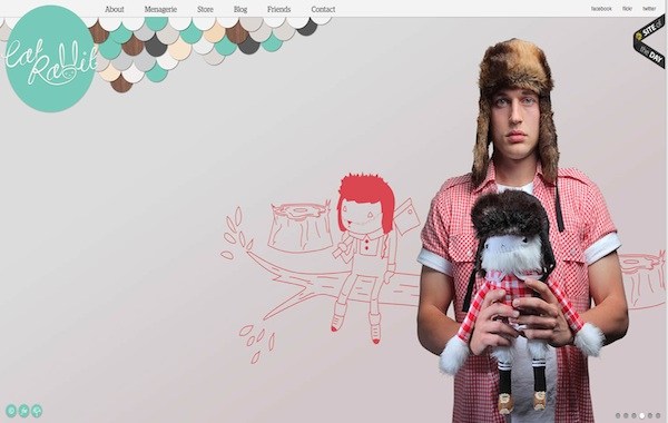
Cat Rabbit
More Information on Cat Rabbit
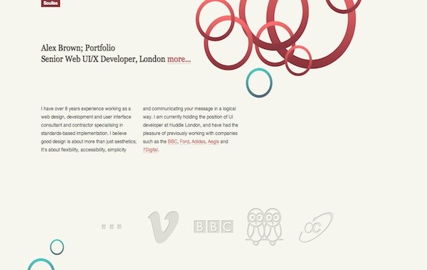
Souliss
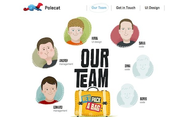
Polecat
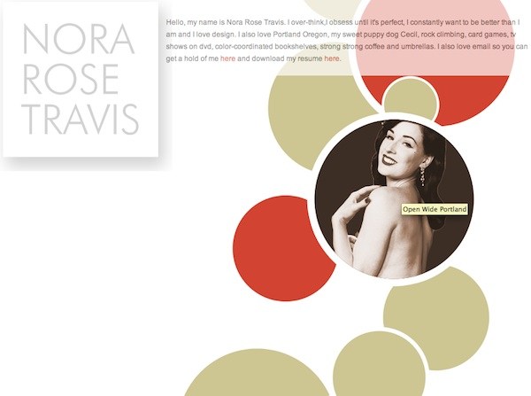
Nora Rose Travis
More Information on Nora Rose Travis
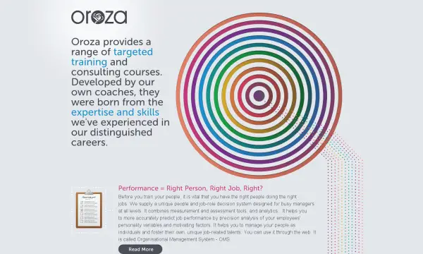
Oroza.com
Aaugh
Vlog.it
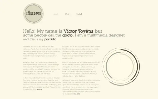
I am Docto
More Information on I am Docto
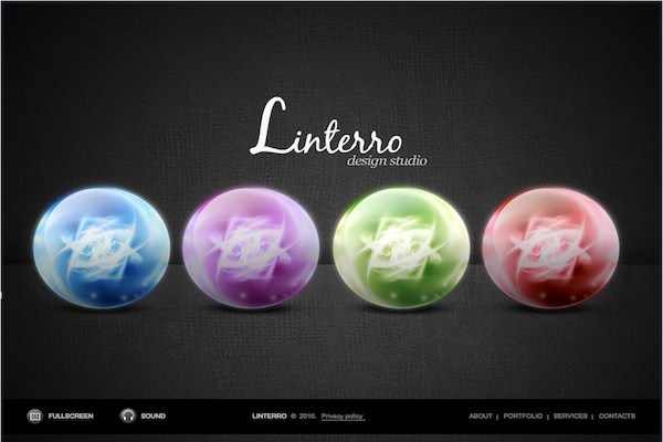
Linterro Design Studio
More Information on Linterro Design Studio
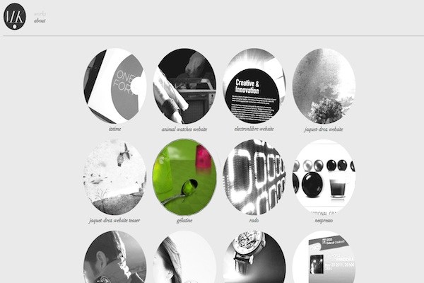
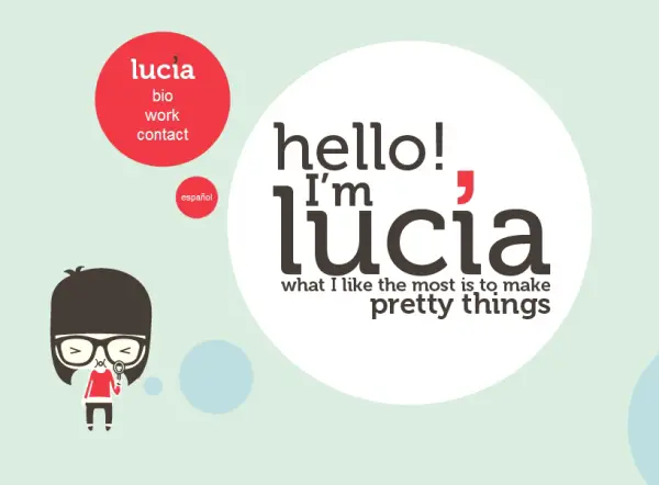
Lucia Soto
More Information on Lucia Soto
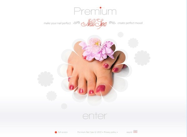
Nail Spa Website Template
More Information on Nail Spa Website Template







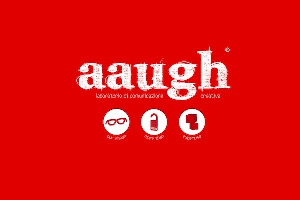







@Koby This is a cool inspiration list. The Aaugh website has some attractive red color. I like it
This is a real inspiration list for me specially you are doing a great job..
All of them are extremely well designed sites. Just curious, has anyone put such a design to good use on an e-commerce website, for example? It would be interesting to know if this design can work in a context where functionality is paramount!
I always use border-radius:50%; to get circular elements in my design. But IE sucks and it wont display it.
@Bharat It is also advisable you check on the source code of the sites listed above. They are showcased so as to learn from them and get lots of inspiration (Remember not to copy the code as it is stealing)
@Bharat You could try learning something from adobe cookbooks rounded corners / border radius, css3 and IE versions below IE9
@ Koby. I like your original idea for a web collection. I don’t often see circular collections.
In web design, circles aren’t often used, because it is easier not to use them. I wish it was easier to incorporate them into my designs.
Wow, nice templates good work done.
Circles vs Squares…I prefer circles as purest of shapes.
Hey what about ovals, hexagons, name them…. what do you think of them in web design
yes
I guess we’ll see more rounded elements as ccs3 become more established.
The circle element is barely shaped into websites, it always comes with another elements, but almost never alone, it is nice to see websites that are designed by this element alone.
Some are more subtle than others. But as you mentioned your already viewing a website on a rectangular machine and which that gives me an idea ; ) thanks : D
Eye Styles and Amazee labs are very nice designs. This something everyone would love to have. Thanks for the share team SloDive.
These are superb circular we elements. They are all unique to each other.
Really it the circular elements are used with the right techniques and creativity they will surely make a beautiful web design.
As the circular elements looks simpler, it looks attractive if used at appropriate manner and with creativity. This collection is really inspiring ones.
These are all inspirational and motivational, nothing to say you are just awesome.
Creative Web Design template is looking so beautiful with black backgrounds.
Really a creative types of circular elements web design are shown these can be used in creative ways i like the Amazee Labs web design as it look pretty awesome and cool.