
We live in times when enough is never enough despite the fact that variety is becoming more varied every day. Today we are spoilt for choice but it has also created doubts. This very dilemma has led people to believe in the fact that less is more and most of them are getting oriented towards minimal and subtle things. This can be seen in many aspects of life especially designing and display. Talking of websites, simplicity and minimalism are ruling the roost here in the color scheme.
Black and white websites continue to charm the clients and web designers get enough work on this theme. The black and white backdrop, apart from being elegant and corporate looking, does not distract. The viewers can read it easily and the vintage look gives it a tone of being rooted and believing in values and ethics. Professionals with more of informative content prefer it on any other theme. However, it does not mean that it is bereft of spice and juice. You just need to put in things and graphics in the right place and in the right way and then wait for the magic to unfold. Black and white would look class apart from the colorful tones. Here is a compilation of 30 such designs in the plain monochromatic theme.
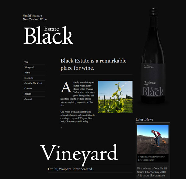
Black Estate
Perfect arrangement of pictures and information with a beer bottle as the logo in background makes for a classic appearance.
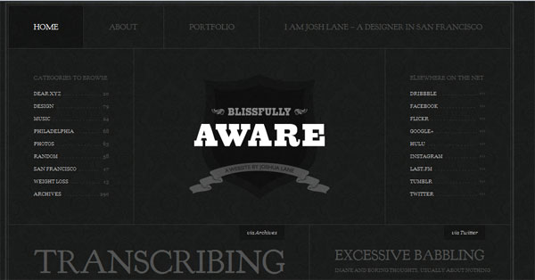
Blissfully Aware
Cool and spacious design with captions spread out at fair distance grab attention quite fast.
Blissfully Aware
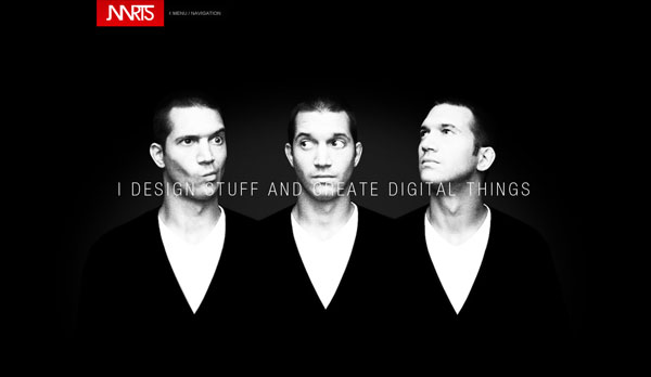
Jasper Aarts
Emotive and animated the entry of red at top makes for a beautiful and bright view.
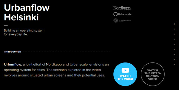
Urban Flow Helsinki
A small flow of color on black and white website with a video introduction is an effective way of reaching out.
Blake Allen Design
Bold, thick fonts describing the services in white pasted over a black backdrop along with a catchy slogan create a vivid picture.
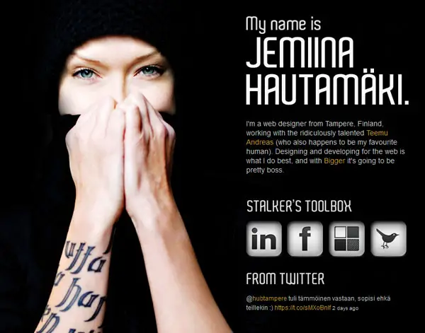
Jemiina
A personal website that arouses curiosity with its reputation and witty introduction.
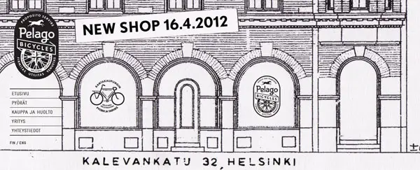
Pelago Bicycles
The vintage charm of the black and white website with crisp anatomy and neat logo and banner.
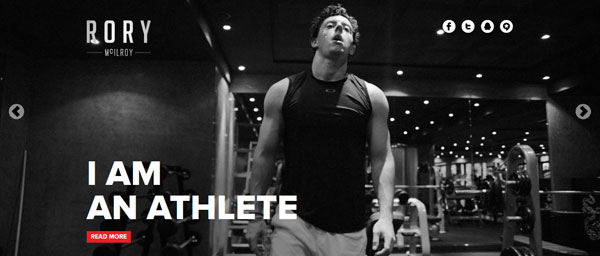
Rory Mcilroy
The fitness trainer in his spacious gym and the social networking site plug-ins make an effective, cool statement.
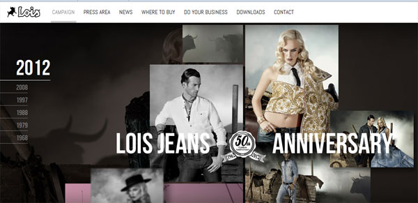
Lois Jeans
Celebrating its golden jubilee with a mix of slightly colorful images, the website looks soberly attractive.
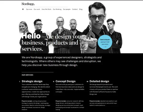
Nordkapp
The team members on top with a brief description of services offered below and a highlighted bubble bearing an appeal propel you to find out more.
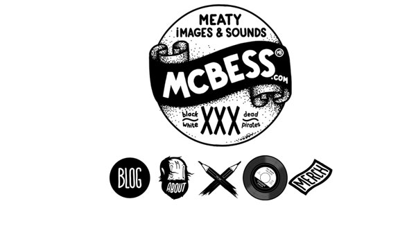
Mcbess
Neat and minimalistic, the images leading to details are worth a serious look.
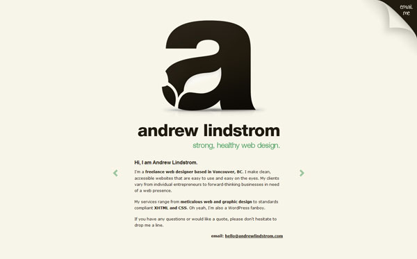
Andrew Lindstrom
This one uses creativity in style with an intelligent logo design and cool description done with a slight splash of green underlining the service quality offered.
Roman Wurtz
Plain and interesting, it keeps you guessing and makes you look forward to the things that are about to come.
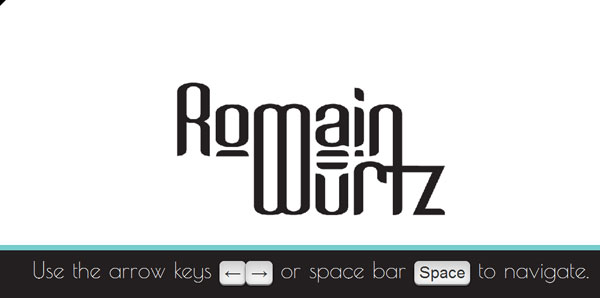
Roman Wurtz
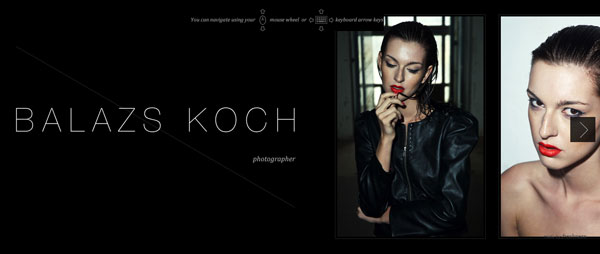
Balazs Koch
A sample snapshot clinches the deal for this photographer with the online viewers.
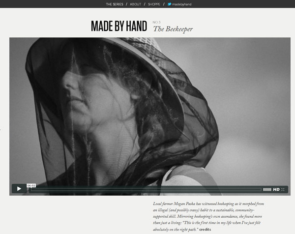
Made by hand
For the unconventional job of a beekeeper the black and white old-world-look is the best.
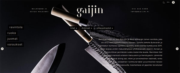
Gaijin
Images on a black backdrop with white lettering giving the details has a focused display.
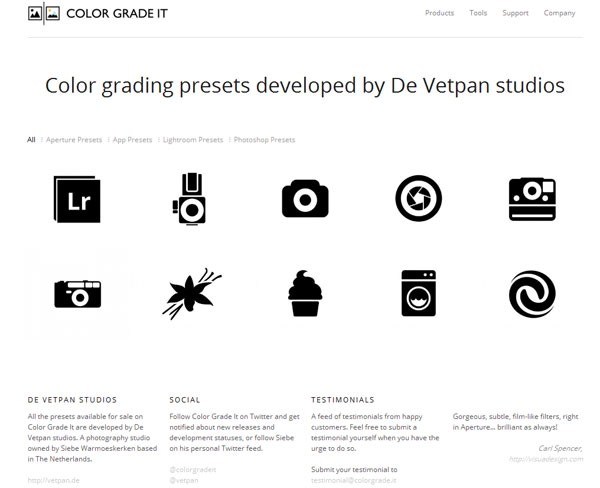
Color Grade it
Minimal typography below with pictures spread on top against a white backdrop look sharp and focused.
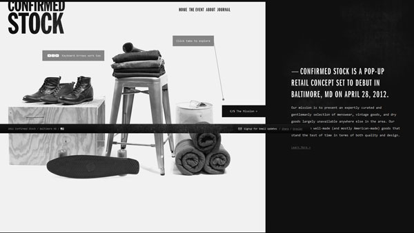
Confirmed Stock
This website with images on left hand side and a small description on right looks elegant and stylish.
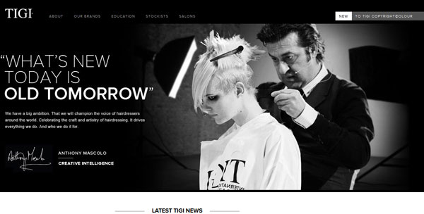
Tigi Professional
An appealing image and an eye-catchy slogan with captions on top that leading to details looks interactive and attractive.
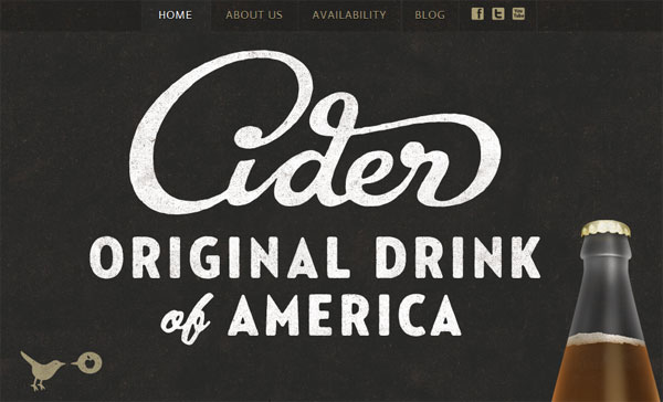
Austin Eastciders
Minimalism rocks gain with a neat and precise look establishing the website distinctly.
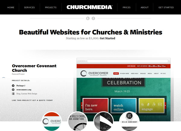
Church Media
Cool, interactive website with an easy navigation layout mixed with color on a black and white backdrop.
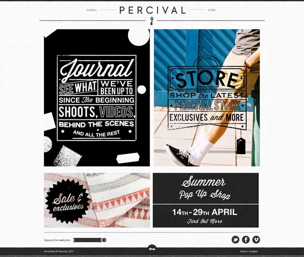
Percival Clothing
Beautiful use of images with crisp typography over it to help the user sail through the site easily.
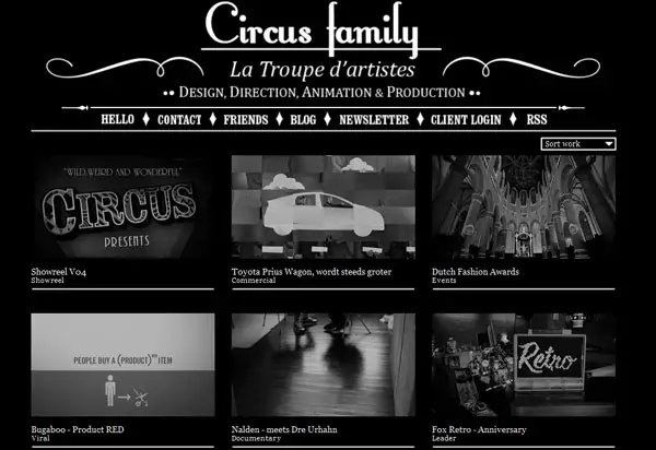
Circus Family
Classic black and white website designed with a clean layout and images gallery as a window into the work and performance of the company till date.
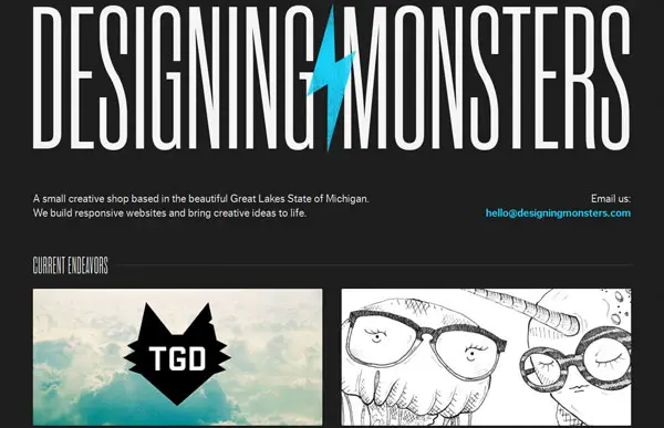
Designing Monsters
Unique layout employing minimal use of words along with a small use of sky blue and cool images brings the website into a different league.
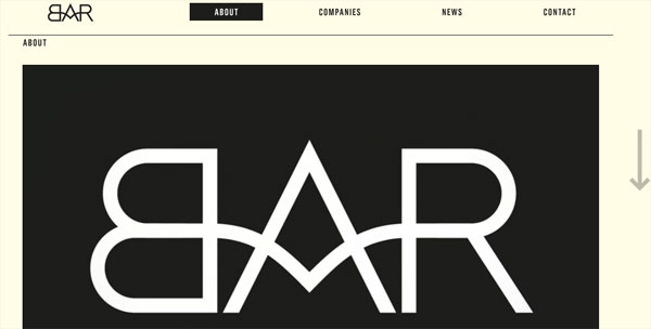
BAR
Cool creativity that grabs attention in an instant with its graphic design and low fuss navigation menu.
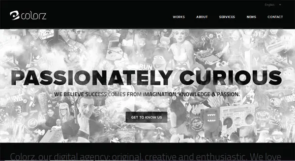
Colorz
A collage background interspersed with a soothing and precise tagline over it creates brilliant contrast and effect.
Colorz
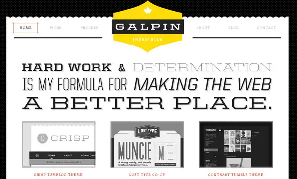
Galpin
The website focuses on its policy and brings forth the company insignia in bright yellow which looks subtle but makes an impressive statement.
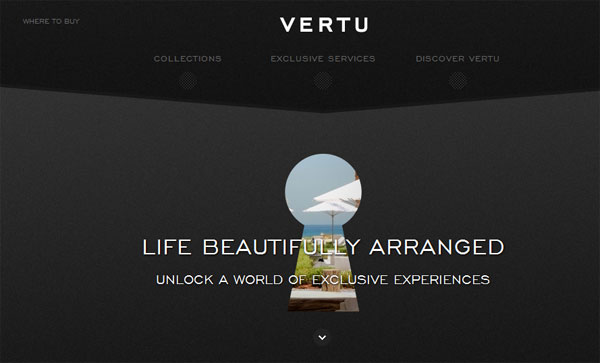
Vertu
Twin shades of black used with a colorful logo at the center looks well-ordered and clean inviting one to explore more.
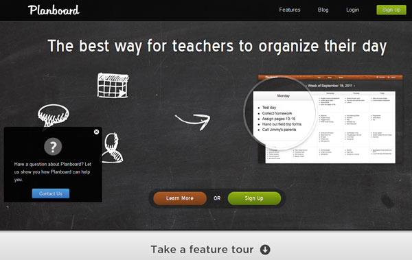
Plan Board app
Interactive and properly highlighted with use of simple graphic images gives the website a marked edge over others.
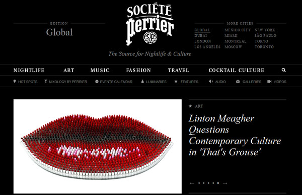
Societe Perrier
The flashy image on left side coupled with white typography on a black background gives all the details in an uncluttered fashion.
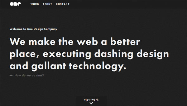
One Design Company
This one catches the attention with its bold typography at center embossed on a black and backdrop and well-trimmed captions.


These templates are awesome. I can’t get enough of them, to bad that you don’t have more. If you can recommend other Black and White templates I surely appreciate your gesture. Thanks!!!
Viewer’s point of view: if you will consider black and white as your web color scheme… You must focus on typography. I think, on my own humbly opinion, that boost up the power of web design.
This is a fantastic showcase. They show that you don‘t always need splashes of color to make it look good.
most of my sites are black and white…i really like black and white website’s…thanks a lot for sharing this one..
Many of these websites are also worthy of visiting. Made By Hand is one of them.
Black and white is a great combination. These designs looks very amazing.
WOW. I was stunned by the first design. That’s really nice. I’d love to have that. hahahah
The black and white combination websites really looks professional and decent.
These designs look sleek and elegant, very smart. Thanks for post..
Black & White is always the best. You can also consider this site http://www.brokenglass.in to include the same into your next list.
These designs look wonderful. I wonder where you look for these designs and the stuff in this site. You‘re really good at listing stuffs.
Its true that these black & white web designs have corporate look and also elegant. The first design, Black Estate is very nice and could make the content so clear for website visitors.
Actually black and white websites continue to charm the clients and web designers get enough work on this theme.
I liked the Societe Perrier black and white website design it very nice.
Societe Perrier black and white website design is looking cool. Like it. Thanks for this share.
I like the Vertu website design because of it’s twin shades of black used with a colorful logo at the center which give it cool and attractive look.
Nice collection of black and white websites. Thanks for sharing.
can you help me to translate the names of my children.,.. ELAM JAN, EISCHA CHLOE, and ERWILL STEVE…i want them as a tattoo on my back…and also this sentence ” you guys are my inspiration and my strength, I LOVE YOU to the moon and back…Thanks!!
can you help me to translate the names of my children.,.. ELAM JAN, EISCHA CHLOE, and ERWILL STEVE…i want them as a tattoo on my back…and also this sentence “ you guys are my inspiration and my strength, I LOVE YOU to the moon and back…Thanks!!