Tourist websites are made to attract prospective visitors to the place and thus earn maximum name and fame. But will you really go to an destination who has an ugly tourism website? Most probably no. An Ugly tourism website can be a big turn off and people jump to next option without second thought.
Today we have listed 8 Ugly tourism websites that are a perfect example of poor design and execution. Although the content they have may be best but no one cares to read it after seeing the design. See for yourself.
If you like this article, you might be interested in some of our other articles on Online Store Design Collection, Effective Web Designs, Ecommerce Websites, and Flash Websites.
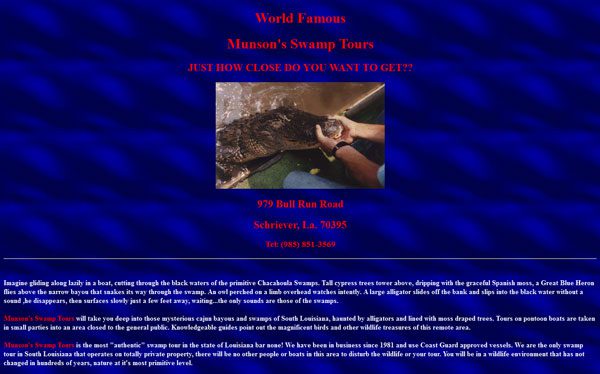
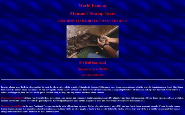
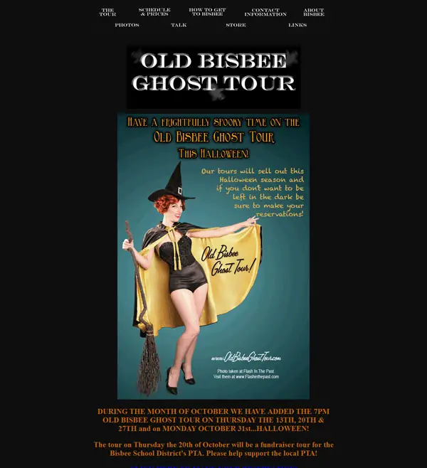
Munson’s Swamp Tours
More Information on Munson’s Swamp Tours
Caravan Parks
More Information on Caravan Parks
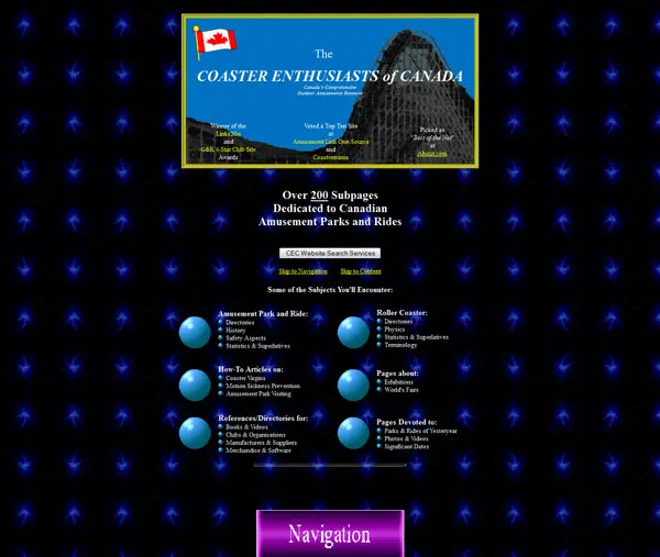
The COASTER ENTHUSIASTS of CANADA
More Information on The COASTER ENTHUSIASTS of CANADA
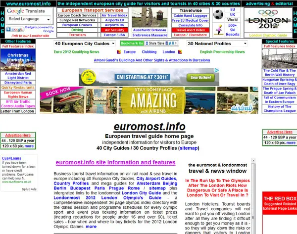
European travel guide
More Information on European travel guide
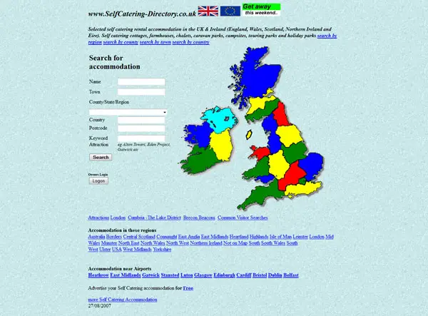
Self Catering Accomodation
More Information on Self Catering Accomodation
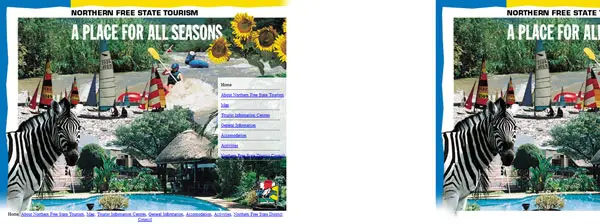
Northern Free State Tourism
More Information on Northern Free State Tourism









I love to critique designs as much as the next guy, but this roundup post appears to be a little mean-spirited.
First, calling the sites “despicable” is inaccurate at best. Are they really so bad to the point that they’re immoral?
Second, none on the list are official tourism websites. They all appear to be businesses or directories offering tourist services in various locations. In this case, they’re just like all other business websites, where the owners either haven’t been able to justify funding for a proper site, or they are just unaware of the importance of professional design with regards to web presence.
Lastly, why not offer a short explanation for each site as to why it’s bad? You point the finger and call names, and then offer nothing constructive in return. Maybe the site owners would be willing to make some changes if they knew what was wrong, but I have a feeling they’re just going to be mad or embarrassed to have their site featured here.
Well said, Michael – I agree!
While some of the sites are indeed ugly and not built properly, most of them are small businesses and non-profits offering information for free. None are really what you could categorize as “tourism” sites – as in, something that is meant to sell tourism to a specific area.
It is not helpful to criticize if your criticism is not constructive. If I were one of these business owners, I would just be pissed and offended, and not take your words seriously as you did not really back them up. It just sounds like an emotional opinion.
I’ll second Mike’s suggestion of adding a short explanation of what is wrong with each site that is listed, rather than leaving the unknowing creator wondering why their site is bad.
Hi Sarah
Thanks for your comments about the rather sad pointless article by Sunalini Rana – it serves no constructive purpose except perhaps prmote to the authors website which is loud disjointed an in your face anyway!
Even though the pot has called the kettle black I know the aesethetics can be improved and this is being worked on at the moment but I am not loosing sleep over the problem. Why should I with an average of 70+ of visitors saving it in favourites because its comtent rich and dozen of the pages are page 1 ranked in generic search results. Perhaps the ugliness helps and google may have a sofft spot for content over design !
I am not pissed off by Rana’s sadness such comments generate traffic and every little helps so though it not her intention to be supportive let her be a strop.
Your comment about funding was relevant at one stage but the bigest issue has been the evolution of the site which started off as a 1 page guide to Prague but got out of control! Its not as you say an official tourist site just an information site which is very different.
The other issue until last month was finding someone who could redesign the site- recode it and put into a wordpress in aformat that I wanted rather than one that would look good on their cv! That is sorted now and euromost will have a new life i Febuary after the sister site londonmost.info has had her New Year Treat.
Thanks anyway for your perceptive intervention
Take care
Oliver
@oliver And what do you really mean with “…the pot has called the kettle black…” who’s the kettle and pot in this case?
Most of them were lacking a central sense of focus. I didn’t know what to look for and how to even start looking for it at the landing page. There was simply too much going on, eg. European Travel Guide.
A few look like they were built in 1998 using Netscape composer.
Totally ugly. I don’t see why a visitor to these sites would dare come back to visit again.
Seems like these websites designers are still living in 1990’s. They need to update these websites constantly!
Very bad design. Actually there is no design at all, just some HTML text with images.
These tourism websites designs not gonna attract any tourists they need a makeover.
Really a good collection of tourism websites are shared here which can attract the tourism attention toward itself.