
Red is an instant eye-catcher but requires careful consideration before using it in a web design. Being a bold color, red must support and justify the theme and feel of a website. If red is well balanced with the theme and motive of the website, besides the layout and content, it is sure to make a striking impression on the visitors.
Red by virtue will reflect thrill, depth and action in your website. It could also denote, love, anger and dark emotions. You can represent a lot with the correct red. We have collected a list of 30 red websites, to get you inspired about using red in your designs.
If you like this article, you might be interested in some of our other articles on Blue Websites, Great Websites, Creative Web Designs and Best Website Designs.
Never A Better Time
Republica is a creative looking website where you buy and sell property.
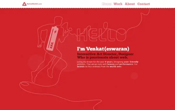
MeandMyAAA
Interesting and interactive website of a web designer.
Pie Wie
The popular and delicious red of Pie Wie Asian Diner.
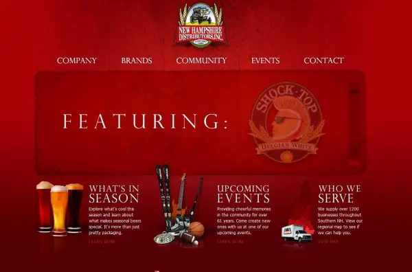
New Hampshire Distributors
The exclusive New Hampshire red to maintain the mark and status of the brand.
Khai Liew
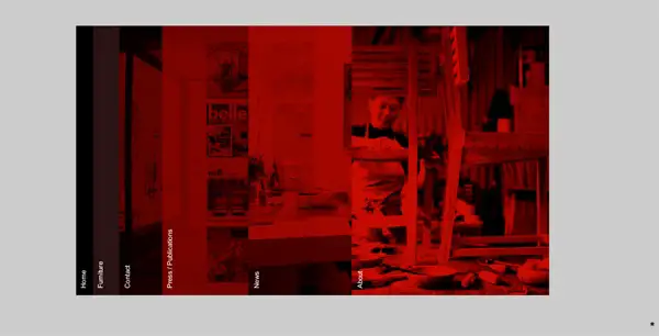
Red Khai Liew website displays its categories in interesting card-pulling style.
Thierry Castel
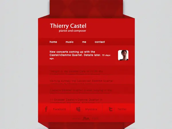
Creative website in red informing about an affluent pianist and composer.
Le 28 Theirs
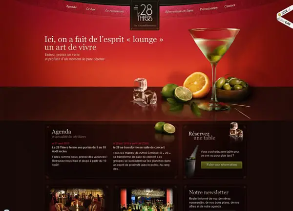
Classy red for a high-profile wine and dine website of the Le 28 Theirs.
Pat Capocci
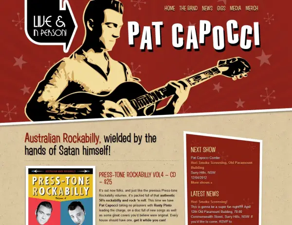
Pat Capocci combines cool comic-style graphics and matching red for the band’s website.
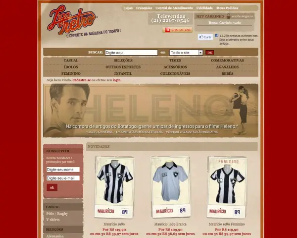
Liga Retro
Retro magazine style cover on a red color base goes perfectly with the Liga Retro theme.
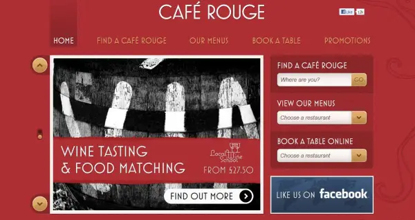
Cafe Rouge
Cafe Rouge successfully holds your attention with the color scheme and well displayed content.
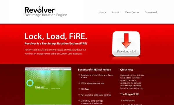
Revolver
Revolver is a fast image rotation engine in red.
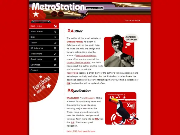
MetroStation
Red website of an author and web designer who loves living in colors.
Ad Litteram
Soft red, with a hint of pink and an illuminating centre serving as an eye-pleasing color scheme for this website.
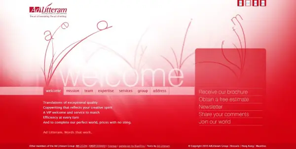
Ad Litteram
Holiday To Go
Elegant red patterned background for a travel website.
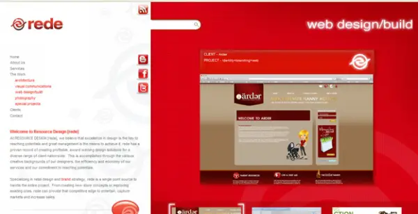
Rede
A smart design in red for the website of professional web designers.
BT Young Scientist
Youthful red for an intellectual website of BT Young Scientists And Technology.
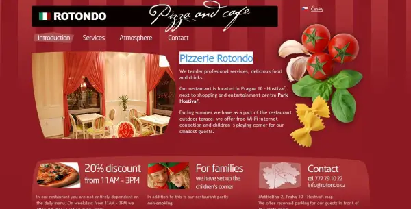
Pizzerie Rotondo
Comforting red for a sophisticated restaurant website.
Revolution Driving Tuition
Revolutionary red and exiting display of content at Revolution Driving Tuition website.
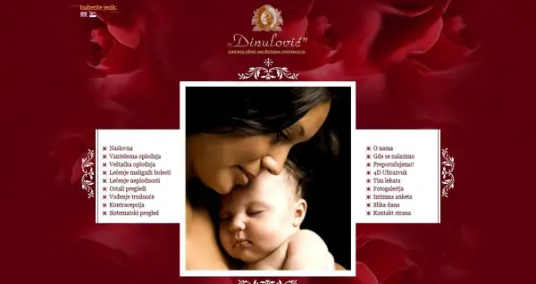
Dinulovic
Exciting romantic red roses in the background for an eye-catching appeal.
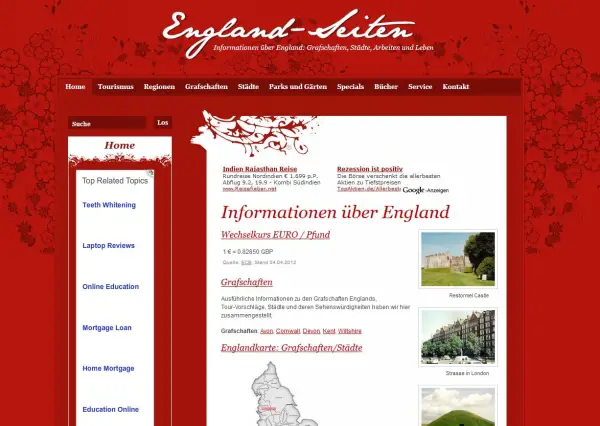
England Seiten
Spring-like red floral background for the vibrant England Seiten website.
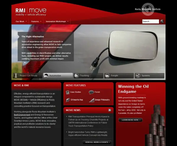
RMI Move
RMI Move looks great with red boxes and categories on black background.
Zoossa
Red wood texture background with many more reds to rock Zoossa the way it looks.
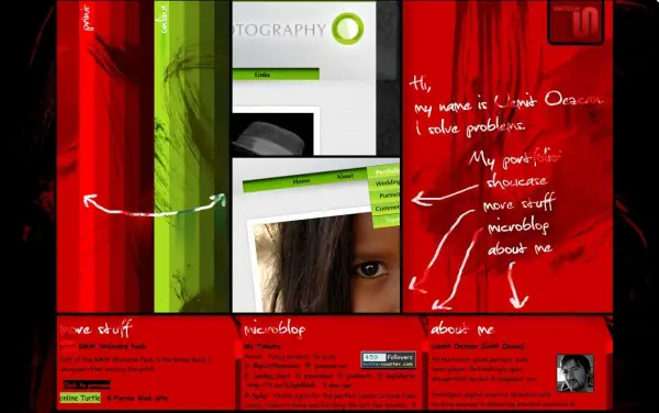
Uemit Oezcan
The glossy red and fantastic design will remain on your mind for quite a while after you visit the site.
Them Crooked Vultures
Wicked red sky with little vultures flying around.
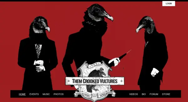
Them Crooked Vultures
Ketch Studio
Patterned red background for an artistic elegance to the designer’s website.
Red Mountain Med Spa
Soothing color scheme combined with red on the Red Mountain Med Spa website.
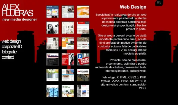
Alex Flueras
Red background with black silhouettes on Alec Flueras’ website.
Drop Of Red
Translucent red to go with the name of the website, “Drop Of Red”.
Nebraska
Crowded website with red pictures and red background.
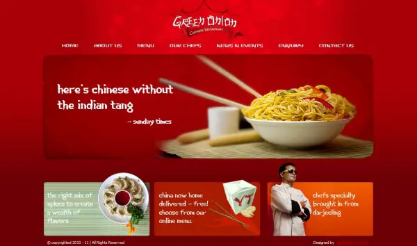
Green Onion
Spicy chilly red on a Chinese cuisine website of Green Onion.



















red is awesome! Catalyst Interactive also has ared website.
@Kim The site is ok but there’s something that’s really missing – content. Just look at the white space under the ‘Custom Web Design, Development and Apps’ section. I bet you should overlook on that. Content is king man!
Awesome list of red websites. You might add KFC too into the list.
Based from the above examples, I think red websites suit for restaurant-like websites or something related to food. I don’t know why but it looks more delicious. Anyway, great collection :)
I always gets it hard trying to craft a design in red but for now I guess these designs will be an inspiration to me and all others with similar difficulty like mine. Thanks
I am seeing everything red after seeing this images!!
@SarDarKnight Your can’t be serious, tell how you are able to write and submit the comment when every you see is red. Any it’s cool!
Adding to this list of great websites in red, here’s a super cool site in red that every needs to see http://workat.tombras.com/
Thanks for the link to Tombras’s site it definitely was worth visiting, red for the opening color and then bold bright colors for the other pages, I enjoyed the visit!
A great collection of red templates their, thanks. It is certainty a striking colour for a blog or another kind of website.
Great collection. Not all are exceptionally nice, but still good as an inspiration resource. Thanks!
Great collection indeed! It seems like each designer of these websites has discovered a personal shade of red to associate with the idea of the site.
Nice collection. I thought Red color is not meant for professional websites but these red websites proved me wrong.
Nice collection of red templates, thanks. It is certainty a striking color for a blog or another kind of website.
Never A Better Time is a very good looking red color website which looks great.
All these red color websites looks very cool to me. Thanks for the compilation.
All the websites with red color are looking pretty cool but i like the Pat Capocci websites most.