
In today’s world of world wide web, having a website for your business is more important than any other form of communication. Today, web designers and business owners pay great attention to the minutest details of their website because they realize the importance of having a logical, well constructed, as well as aesthetically pleasing website.
Color scheme of webpage is very important for its aesthetic appeal. The color, grey attracts quite a few designers, and it has a solid reason behind that. Grey is the color of intelligence, reliability, and maturity. It serves as a great theme for serious portfolios and business websites. Other websites may also incorporate grey to highlight buttons and other colored features on the website.
Intense colors can give your website a vibrant appeal, but grey in the backdrop works very well in balancing the colors and giving a clean impression, it also brings out other colored features. Moreover, it will depend on the nature of the website whose character may only flourish with the grey color scheme.
Lets look at some examples, check out our collection of thirty amazing grey website designs below, they may inspire you for your own webpage and blog!
If you enjoyed this articles on Grey websites you may be interested in the following articles on different colors of websites, such as; Green, Red, and Orange.
Rangus
The talented wonder child, Ross Angus, displays his skills on his grey website.A great way to highlight the bot on a grey backdrop!
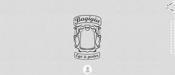
Bagigia
Light grey faux leather style texture making Bagigia an elegant looking site. Simple and sophisticated.
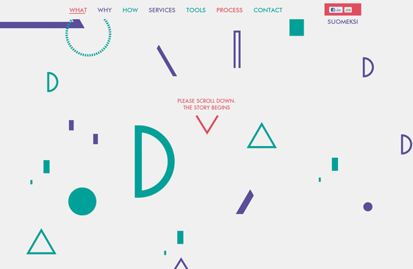
Kopla
Light grey website with very little text but colorful symbols and initials on the home page.
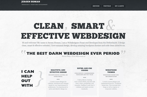
Jeroen Homan
Clean and simple design in grey color with black top border. The website is well organized, and easy to browse.
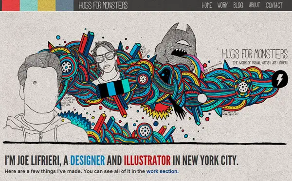
Hugs for Monsters
Hugs for Monsters with colorful graphics on snowy grey. A great way to bring you the vibrant colors.
Fhoke
Award winning web designing agency chooses sophisticated grey for its website. The website uses combination of grey and red to bring out the website.
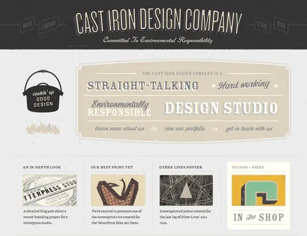
Cast Iron Design
Cool grey and black combination with text typography. An aesthetically pleasing website that is bound to keep users interested.
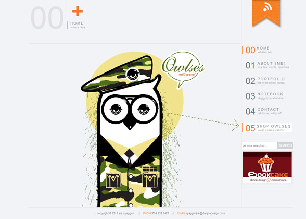
Joe Nyaggah
Neat grey website with all the categories and buttons placed without any clutter using orange and black. A sophisticated yet trendy website.
Rocketfuelled
Refreshing color scheme using grey in the backdrop and cute vibrant colors for the content.
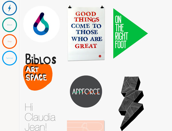
Rocketfuelled
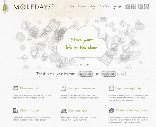
More Days
Snowy grey and cool slideshow playing, highlighting the latest features on More Days website. This website is chic, trendy, and fun!
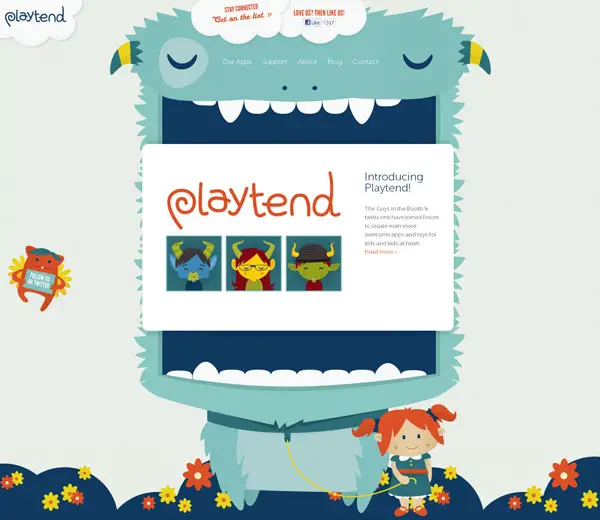
Playtend
Cute grey website encouraging imagination and creative play in children. An adorable website that will keep kids of all ages interested.
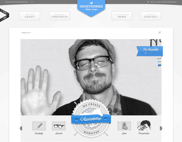
Ghost Horses
Ghost Horses uses smoky grey dotted texture on the website. An awesome monochromatic page!
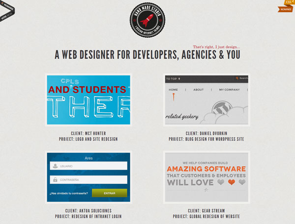
Hand Made Studio
Great looking fabric-touch grey texture in the background. The website does not only have a carefully thought-out color scheme, it is well organized, keeping users attracted.
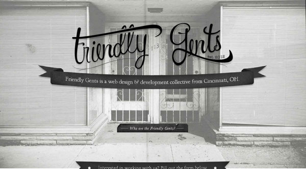
Friendly Gents
The grey effect of the black and white with cool images in the backdrop. An attractive web page for a web designing business, this page is bound to catch the customer’s eyes.
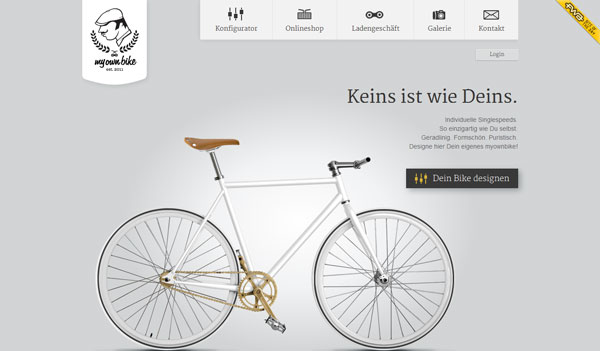
My Own Bike
Illuminated at centre, the soft grey background of My Own Bike. Simple, elegant, and sophisticated.
Chaos
Cool eye-soothing grey sparkled with colorful images of gadgets and accessories. If you want to keep it simple, while also making provocative, you should take inspiration for the page featured below.
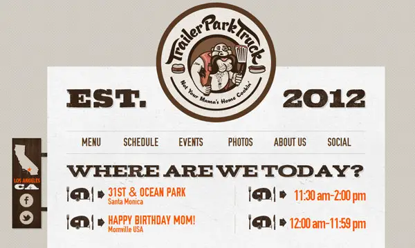
Trailer Park Truck
Trailer Park Truck with light grey with nice brown logo and graphics. An artistic combination of grey and brown.
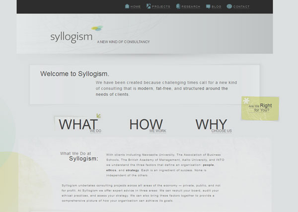
Syllogism
Subtle color scheme using grey and black on top button bar. If you want to keep it elegant, you can go for something similar to the page featured below.
Dizparada
Great tinge of transparent purple boxes on grey background color.
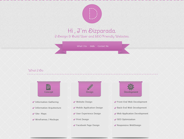
Dizparada
CWD
Greyish white with big yellow typography giving CWD a nice attractive appearance.
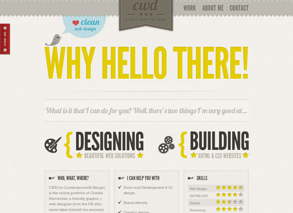
CWD
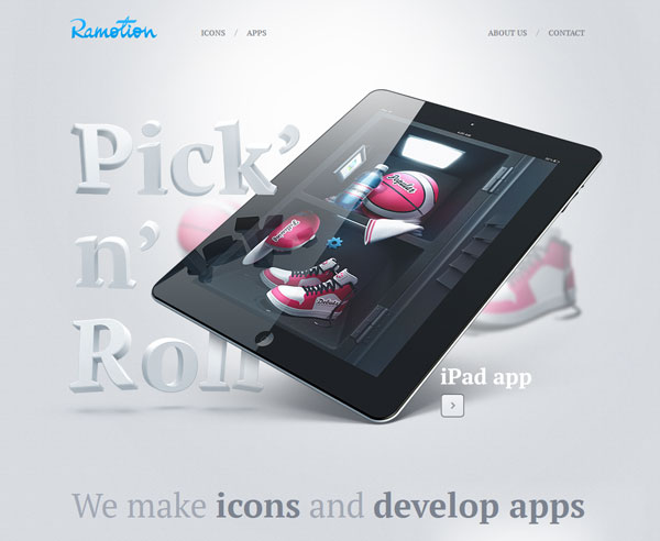
Ramotion
Nice grey with illuminated centre with great placement of images and 3D letters.
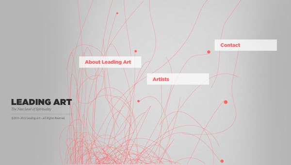
Leading Art
Sleek grey with minimum graphics and text on the homepage.
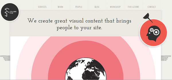
Column Five Media
Column Five is a well displayed grey website with slide show of its highlights.
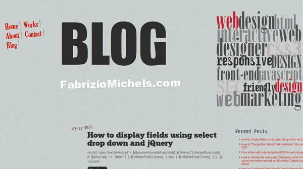
Fabriziomichels
Grey fabric texture background gives Fabrizio Michels a corporate look.
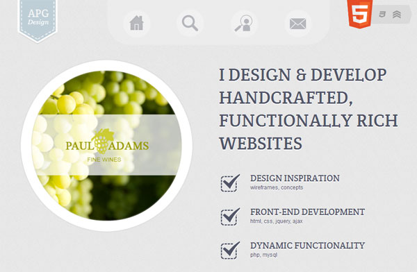
APG Design
APG Design promotes its portfolio and skills with a grey colored website.
Fifty Three
Image in the background creating a natural and classy grey effect.
Wants to be great
Black and white images giving a classic grey effect to the website.
Lend your Leg
Awesome looking grey website giving a cool sporty look.
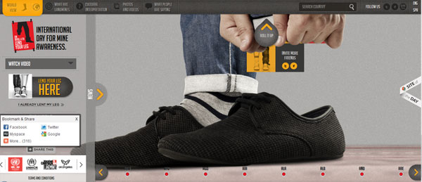
Lend your Leg
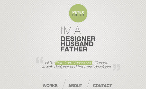
Petex Studio
Petex Studio is a clean, simple and minimalist website in grey.
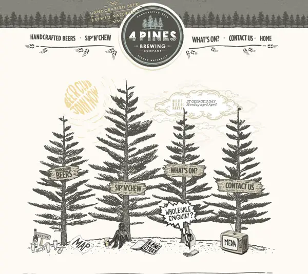
4 Pines Beer
Attractive grey sketch style graphics and top border too has a grey color scheme.















I love grey Websites, they are my favorites! My portfolio tommywebdesigner.com and the most of my websites are built with Grey…they are unbeatables! ;)
A new big image would really go a long way with this themes. Could really use some attention to detail on the gradients, but overall a nice job. I need to find a reason to use these themes for my new blog.
I personally don’t want gray website design, it’s because it looks like dull and don’t have life for me. However, if you will integrate a little bit of texture or white gradient somewhere in the area; it will give life to your design. That’s what I noticed in this collection.
I appreciate the “Fifty Three” website template.. its so awesome..
Wow, many thanks for featuring my web, and in such fantastic company too!
Good luck
Nathan
They all look great, I am inspired to change my website design … again :)
I like how you simply put it that “Grey is the color of intelligence, reliability and maturity.” I likes it mostly for business websites… the end result is always excellence
This grey thing seems to be getting so well with me since you posted this article here. I have also checked the experts at Team Tree House are also quiet well with grey…. check out http://teamtreehouse.com/
Am always very thankful to Slodive for the stuff they continue to share. They are always filled of inspiration with no boundaries, for instance, I recently built a Twitter Bootstrap template from an inspiration from these grey websites listed above. The template can be found here… http://wrapbootstrap.com/theme/acacia-WB001U10E Thanks.
Wish Nathan from a few comments ago had said which website is his. It’s always nice when people stop by and say a thank you for having their work featured. I did visit Friendly Gents website – definitely worth the ‘click over’ to view their work. Excellent presentation btw.
Hi Bev,
Sorry about that…My site is Hand Made Studio.
Cheers!
Grey is color of intelligence.The use of color is really creative.Thanks for sharing this.
I think these design are simply breath taking and really inspiring to look at. This is so cool!
Intense colors can give your website a confusing appeal, but grey in the backdrop works very well in balancing the colors and giving a clean impression.
Grey websites have something which always fascinated me, I like the Lend Your Leg design.
A great post here. These grey websites are amazingly done and are very cool. Great share!
Jeroen Homan gery website has very simple and clean design which looks very lovely.
These grey websites really looks professional and decent. Nice share.
This Hugs for Monsters Grey websites look very attractive because of it awesome color combination which can quickly attract the eyes of people towards itself.