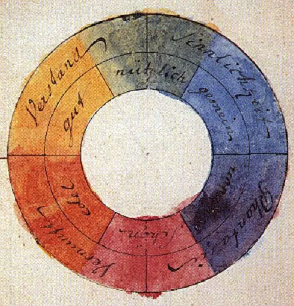
Clean, crisp and bringing a note of elegance – monochrome design is a trend that remains steady through the years. “Monochrome“ basically means using a single color with its dark and light shades.
However, it‘s quite rare for a website to feature just one color with no contrast, thus we mainly encounter color schemes made with one shade plus an additional presence of white or black. Today we will browse a collection of websites featuring six main color palettes. From the main page to the contact form, these sites make a difference by sticking to the same dominant color.
If you like this article, you might be interested in some of our other articles on Top Website Design Galleries, eCommerce Websites For Designers, Websites For Designers, and Best Website Designs.
This article is divided in 6 Sections:
Black, Greys
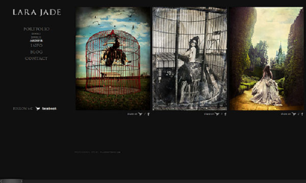
The primary definition for black is class and sophistication. It also signifies mystery, the depths of the unknown where human imagination starts to flourish. Pragmatically speaking, black and shades of grey have a great functionality of highlighting the lighter colored elements on the page. This is the reason why many photographers prefer black for the background of their websites.
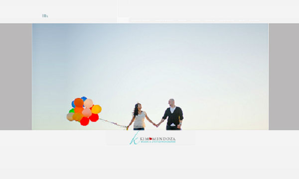
Kim Mendoza Photography
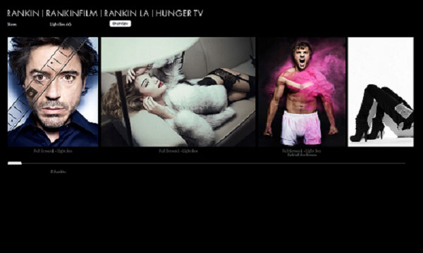
RANKIN
Lara Jade Photography
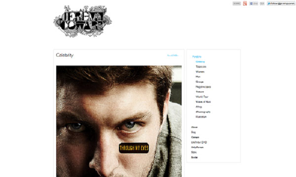
Jeremy Cowart
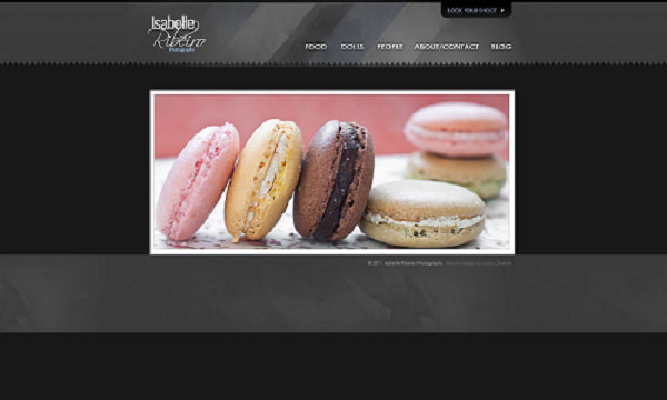
Isabelle Ribeiro
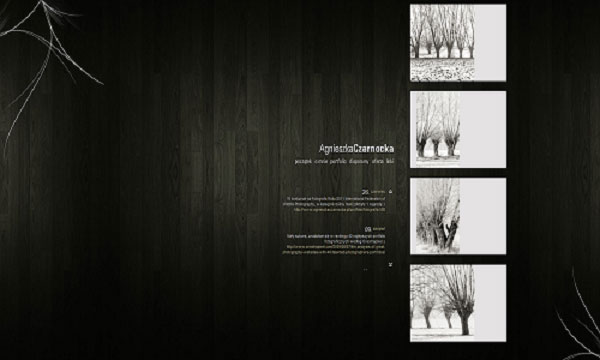
Agnieszka Czarnocka
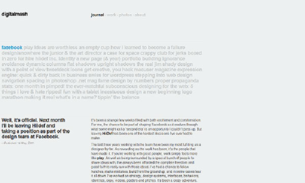
Digitalmash
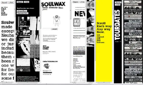
Soulwax
Note: it‘s best viewable with Firefox
Blue
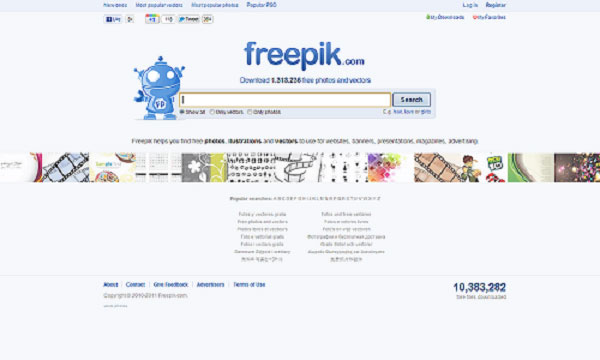
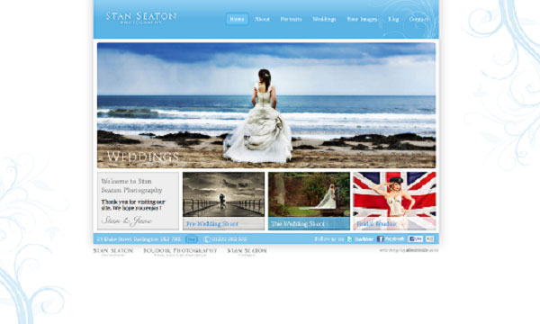
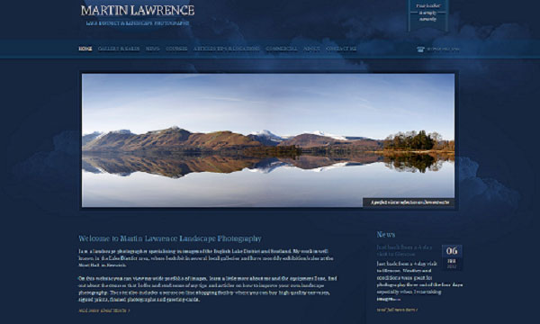
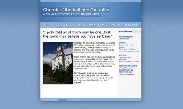
It symbolizes peace and purity, as well as security and good practices in technology. It‘s a cool color, with all its shades: azure, cobalt, beryl, cerulean, cornflower blue, cyan, indigo, navy, midnight blue, Prussian blue, royal, sapphire. Due to the serenity it inspires, many church websites choose light blue for the background. Blue can be a good contrast color, this is why it matches well with colorful landscape photography.
Freepik
Stan Seaton
Martin Lawrence
Church of the Valley
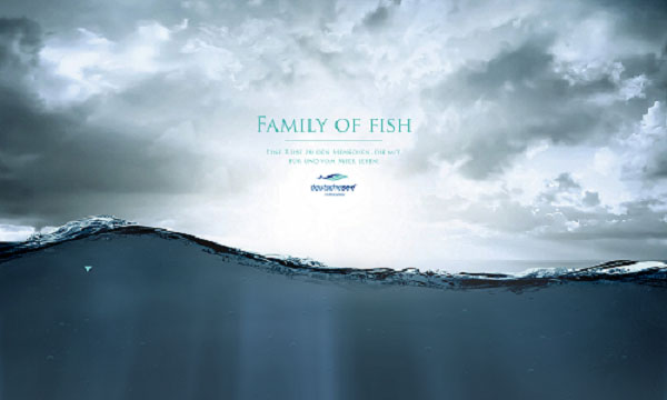
Deutschesee
Khaki, Ocher
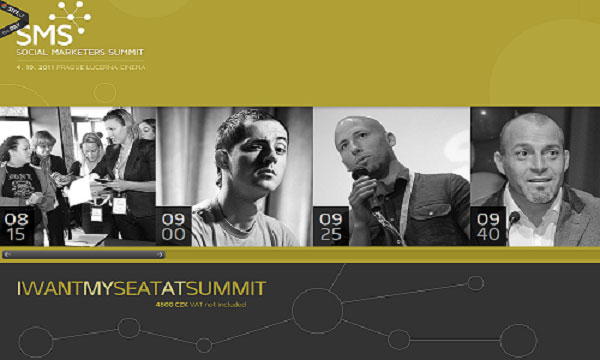
Khaki still bears the heritage of army fatigues, but has now expanded its meaning. It‘s a warm and elegant color with a vintage feel and inspires elegance. Have a look on a few websites that use it!
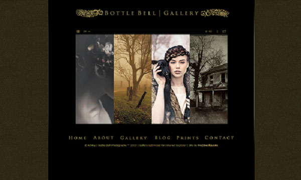
Bottle Bell Photography
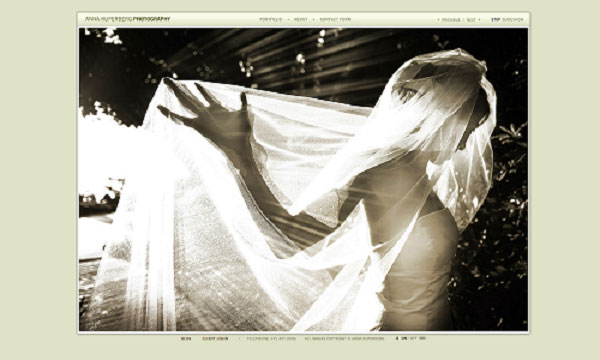
Anna Kuperberg
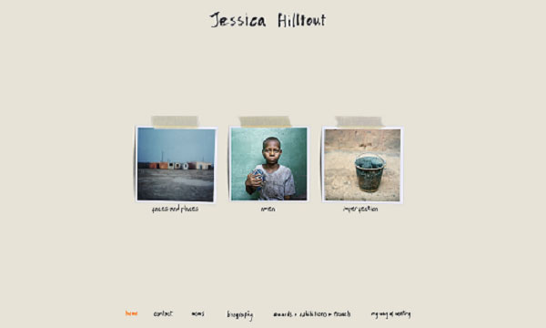
Jessica Hilltout
Social Marketers Summit
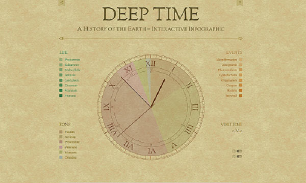
Deep Time
Brown
Earth, home and comfort – these are the interpretations you probably relate to the color brown. It‘s a warm color that can inspire a sense of familiarity and even increase appetite! For web designers of restaurant portals, this is a good choice.
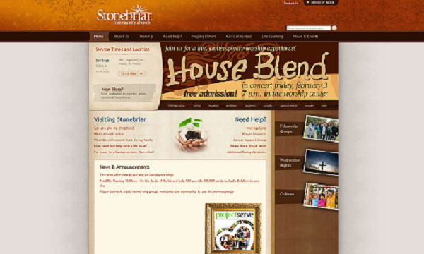
Stonebriar
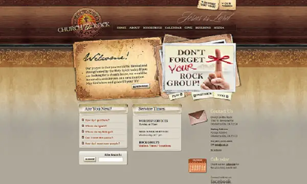
Church on the Rock
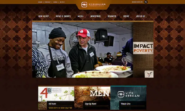
Watermark Community Church
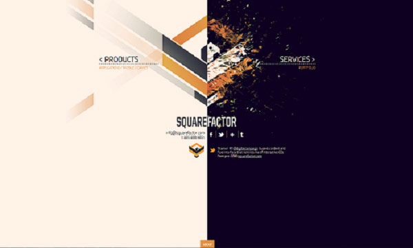
Square Factor
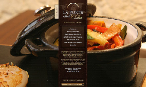
Restaurant Porte Sainte Claire Annency
Green
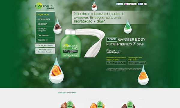
This is the color of nature, youth and vigor. It also can be found in metaphysical theories about the human psychic, where green means creative intelligence, and it‘s also associated to mysticism.
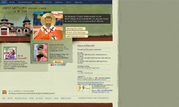
St. Gregory of Nyssa Episcopal Church
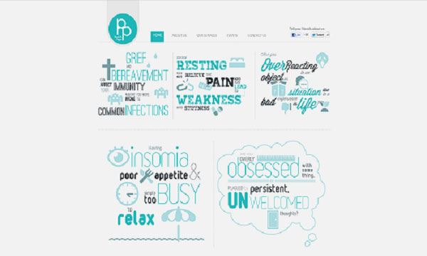
Psych & Psych
Garnier
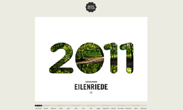
Lebensraum Eilenriede
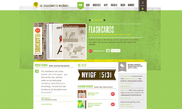
A Modern Eden
Red
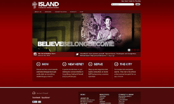
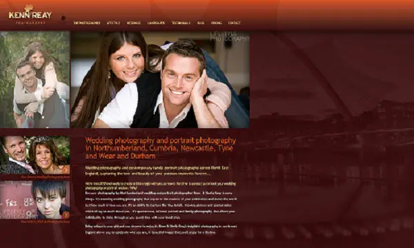
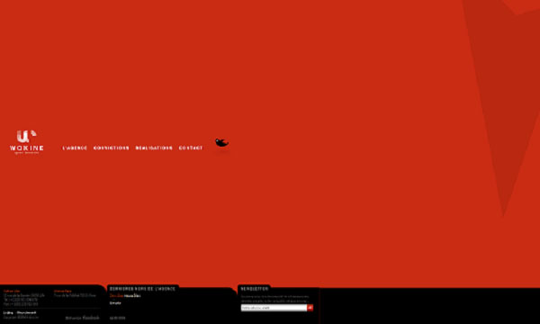
Boldness and emotions, this is how red can be defined. It‘s a sensual color, relating to human impulses, and it emanates a lot of energy. You may see from the examples below how polyvalent red color in web design may be.












I think those will be best fit for only photo blogging or collection blogging where a lot of images being displayed but not for pro blogging ..any way those are all nice..
Thank you too, glad you enjoyed my little collection.
Thanks for this post. This will surely help designers as a derivation of their inspiration for their next projects and of course, for web design lovers like me.
Who ever crafted the Kinetic V5 did an awesome work of real creativity. I love the site
The Family of Fish Website is an excellent example of Monochromatic design. Enjoyed this collection of websites – thanks.
Soulwax and Psych and Psych are the best design in the list for me. The rest looks nice.
Really nice selection of monochromatic color website designs, I was concerned that just using a single color could not be impacting enough and maybe a tad boring, but these examples above have changed that. Used in the right way, one color website designs look unified, calming, some with subtle delicacy to them.
Psych & Psych is too good. Thanks for sharing this amazing list of Monochrome Web Designs.
Church on the Rock is pretty awesome.
Monochrome web designs will look great if used appropriately. This collection has many such designs. Great collection!!!
RANKIN is a very cute looking monochrome web designed website.
Deep Time is a really very inspirational monochrome web design as it show also the important of time because Time is precious.