If a picture paints a thousand words, a photoshopped picture conveys those words more eloquently. Whether you’re an artist, designer, a photographer, illustrator – hobbyist or professional, learning how to use Photoshop efficiently and effectively is crucial to your trade especially if you want to improve your photo quality. Among all Photoshop features, taking multiple visual elements from different images and putting them together into one magnificent frame – often to create the illusion that all those elements are parts of the same scene – is perhaps the most enjoyable and fulfilling projects.
This process is called compositing.
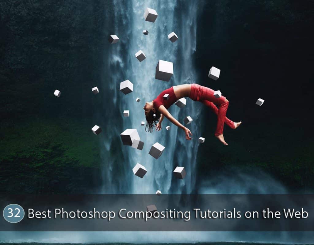
Wherever you look: from magazines to website contents, to digital ads, to group photos, corporate or private, to school graduation or sports portraits, to movie posters and DVD covers, chances are, you’ve seen composites. Photoshop compositing is used in diverse fields such as astronomy, animation, architecture, forensics, web design, even medicine.
Truth is, in today’s competitive world, it is very difficult to find a creative design that doesn’t require some form of photoshop compositing. Whether it’s as simple as changing a background or as complex as creating a fantasy scene from a collection of different photos, you can make use of tricks, tips, and special effects to help you come up with a good composite. The most desirable effect is to create the impression that the image was never made out of different photos. There are many factors of UI UX Design that effects the outlook of the website, so its important to keep update with new factors.
Here are 32 Best Photoshop Compositing Tutorials on the Web and some important rules to help you achieve your most desired results.
-
Lighting
Consistent lighting spells the difference between a great composite and a mediocre one. Compositing images together are one thing, doing it right is another thing, especially when they are all lit differently. There is a way around it though – by employing the same color temperature (warm or cool) and contrast, using brushes, the Lasso tool, and adjustment layers. The most important part of compositing, however, is getting the shadows, midtones, highlights, and hues right during the shoot to make compositing so much easier and so much better. In spite of all the technological advancements, good photography will always be one important part of the equation.
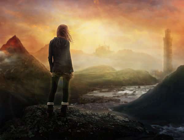
1. How to Create a Stunning Surreal Landscape
-
Linear Perspective
Equally important in paintings and drawing compositions as it is in photoshop composites, linear perspective creates the illusion of depth on a flat surface. In paintings and drawings, all parallel lines converge at a single vanishing point on the composition’s horizon line. This means that objects get smaller as they move further away from the viewer. In a composite, objects that are supposed to appear farther from the viewer must be rendered increasingly smaller as they near the vanishing point.
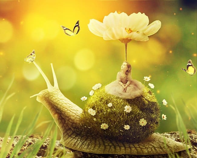
2. Create a Surreal Snail with a Grassy Shell in Photoshop
-
Aerial or Atmospheric Perspective
This refers to the effect the atmosphere has on the appearance of an object in relation to its distance from the viewer. The farther the object is from the viewer, the contrast between the object and its background decreases. The colors also become less saturated and tend to blend with the background color.
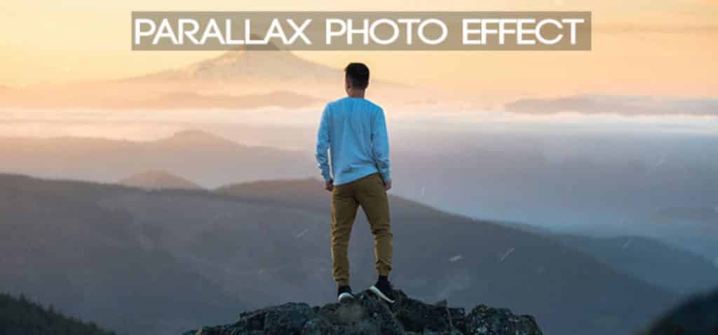
3. Create an awesome Parallax Photo Effect
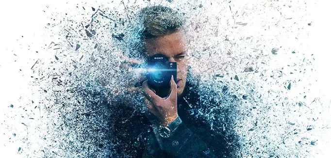
4. How to create a Pixelated effect in Photoshop
5. Chilling decay effect in Photoshop
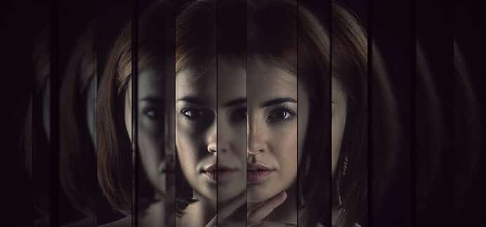
6. How to Create a Fractal Mirror Effect in Photoshop
-
Shadows
If lighting spells the difference between success and disaster, shadows can also make or break a composite. The sure giveaway for a composite is the shadows. You don’t need a solid grasp of physics to be able to make shadows right – as long as you follow these basic principles, you will be able to get away fairly successfully.
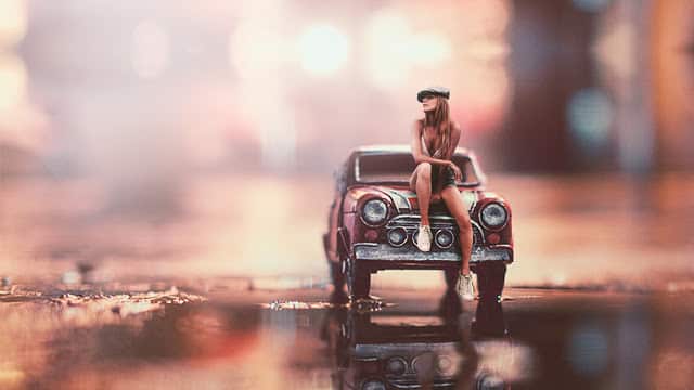
7. How to Make Miniature Photo Style Effects
a. Keep in mind that shadows fall in the opposite direction to the source of light. There are so-called second lights though, the ones that bounce off surfaces, especially shiny ones, so be sure to consider the light source properly.
b. The density of the shadow depends on the brightness of the light. Very bright lights cause very dark shadows and vice versa.
c. Shadows are darkest where they are nearest the object and gradually fades as they go further. Where the shadow makes contact with the object, it reflects a little of the object’s color.
d. The length of the shadow depends on the height of the light source. The higher is the light source, the shorter the shadow, the lower the light source, the longer the shadow.
e. Objects with no shadows appear to float, so always include a shadow where your object meets a surface
f. If the object is translucent, the shadow is lightest closest to the object because it will let some light through.
-
Elements
Make sure your elements match. If your background is taken at noontime, your foreground elements should also have high contrast light. The best photoshop composite artists are photographers – they can match the lighting, scale, proportion, and perspective of their elements at will. It will take a lot of practice, mindful attention to detail and patience to achieve the proper balance of elements in a composition.
8. Combine images in a creative ways
Learn creative compositing techniques for combining images in Photoshop.
9. How to do a Photo Composite in Photoshop
10. Photo Compositing: 7 Essentials of Visual Magic
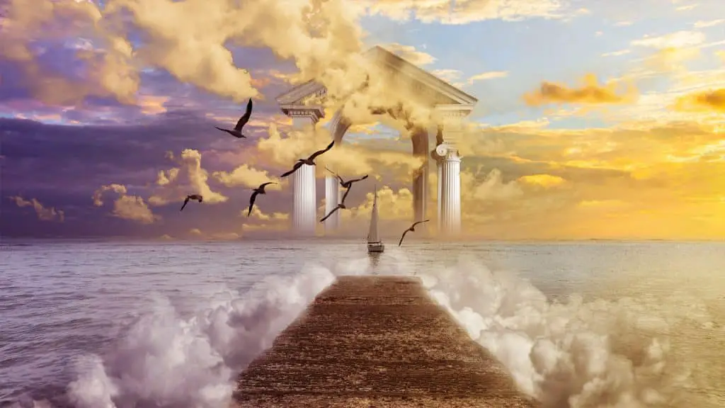
11. How to Make Fantasy Heaven Photo Manipulation
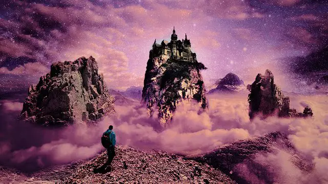
12. How to Make a Fantasy Photo Manipulation – LOST IN MONSTERS ISLAND
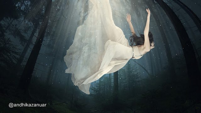
13. Broken Angel – Fantasy Art
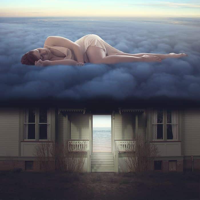
14. Clouds Alone
15. How to Create a World Under the Sky using Photoshop
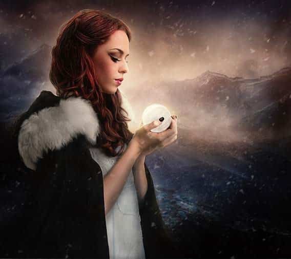
16. Create a Surreal Game of Thrones Photo Manipulation
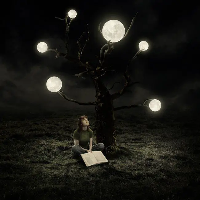
17. Create a Surreal Artwork of a Tree with Moons in Photoshop
18. Photoshop Skills that are for Real
- Masks
While it is true that artistic composition, digital painting, lighting and color grading play a vital role when doing a photoshop compositing, the most important is masking. A good mask sets apart a professional from an amateur compositor.
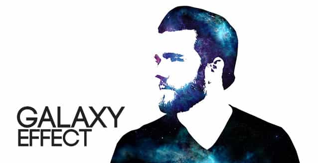
19. Create a Galaxy Effect in Photoshop
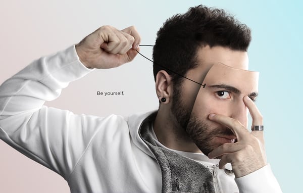
20. How to Create a Portrait Mask Illusion With Photoshop
21. How to Create Color Double Exposure in Photoshop
22. Cardboard Turned to Photo Art
23. How to Create Miniature Effect in Photoshop
There are several masking techniques that you can use to add interesting and exciting effects to your images:
a. To create soft transitions, you can use the Gradient Tool between your masked image and other layers below it.
b. If you want to use the contents of a layer as a mask for another layer, then use Clipping Masks, especially when you want to show an image inside a text.
c. If you want fine and complicated details, you can use Pixel masks, but if you want sharp, clean edges, Vector masks are better.
d. Do you know that you can amend a Vector or a Pixel’s mask’s visibility? You can do this by adjusting the Density slider in the Properties panel, and you can add Feathering to their edges as well.
e. The Mask Edge option from the Properties panel is also very useful to improve the quality of the edges. Use the Smart Radius, Shift Edge and Decontaminate Color options.
f. Lock Transparency is very useful in keeping the contours or silhouette of the layers.
g. Keyboard Shortcuts
Useful keyboard shortcuts that you should know :
*Alt/Option-click on the mask’s thumbnail to enter/exit Mask view
*Shift-click on the mask’s thumbnail to disable/enable it
*Shift+Alt/Option-click on the mask’s thumbnail to enter/exit
*Quick Mask view based on the mask
*Command/Ctrl-click on the mask’s thumbnail to create a selection based on the mask edges
*Command/Ctrl+Shift-click on the mask’s thumbnail to add to a selection based on the mask edges
*Command/Ctrl+Alt/Option-click on the mask’s thumbnail to subtract from a selection based on the mask edges
*Command/Ctrl+Shift+Alt/Option-click on the mask’s thumbnail to create an intersection with your original selection and a new one based on the mask edges
-
Color Harmony
A good composite must have combination of colors that go well together and are pleasing to the eyes. Different colors have differing effects on people. Advertisers make use of this knowledge to their advantage. Every color can arouse a certain emotion. Whatever mood you wish to create, finding your preferred color harmony will do the trick. Strive for balance in your composites. So when you tone an image, the weights, saturation and relative spread of colors should be similar to a harmonized palette.
Here is a tool for finding your color harmony: http://colorschemedesigner.com/csd-3.5/
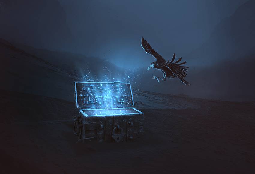
25. How to Create a Magical Chest Photo Manipulation With Adobe Photoshop
-
Focal Point
A focal point is a point of interest that makes an artwork unique – it is that one primary element to draw a viewer’s interest. The focal point your composite should be rendered in sharp focus, placed in the middle. It should have a foreground and a background for it to stand out. You can use fire, rain, fog, snow, light flares, grass, flowers, anything that harmonizes with your focal point without stealing the attention from it.
26. Nostalgic Landscapes Captured in Jars Using an In-Camera Double Exposure Technique
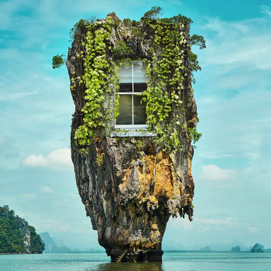
27. Coral Rock House
28. Selective Blending Trick
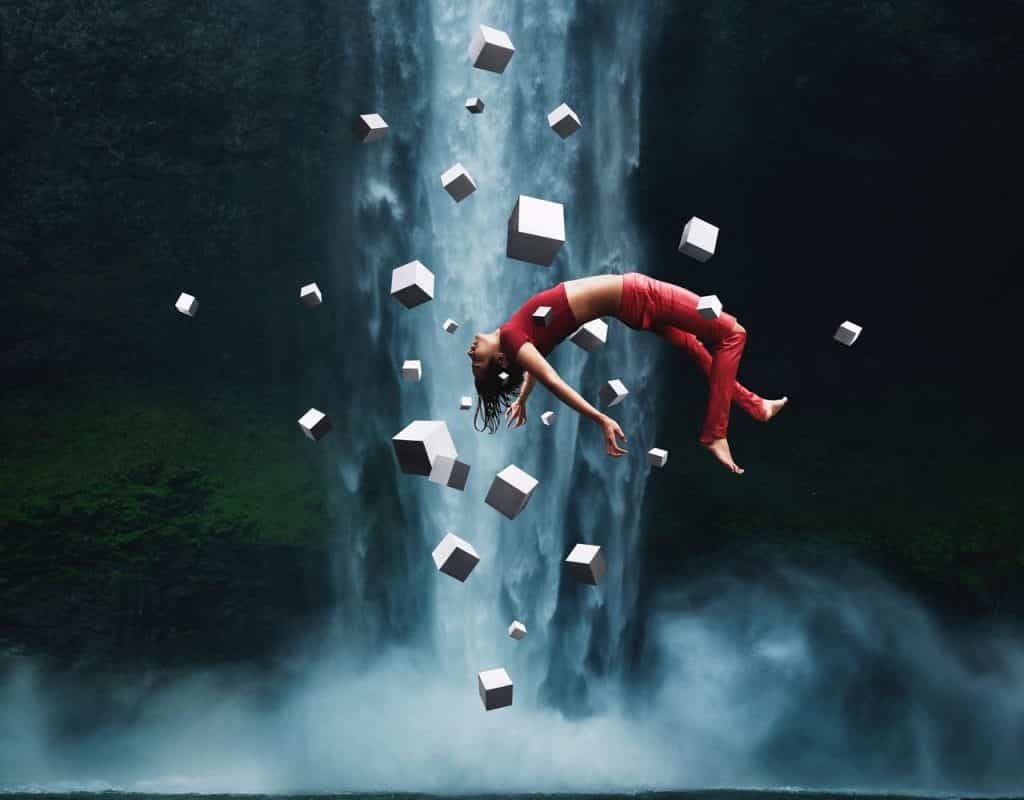
29. How to Make your Subject Levitate
30. Robotic Frog
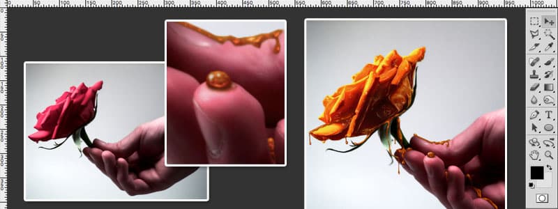
31. Creating Honey Covered Objects Photoshop Tutorial
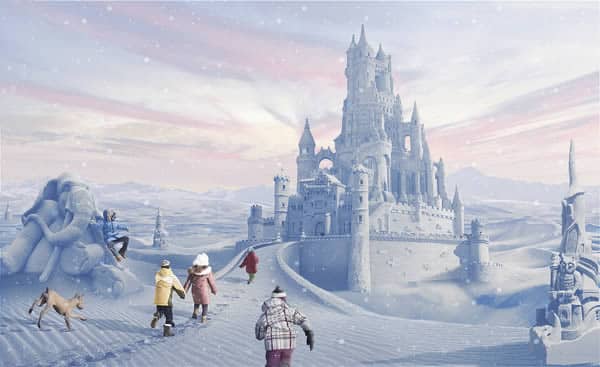
32. Create a Snowy Landscape From Desert Photography in Photoshop
If you master the above rules, your viewers will not be able to tell that your artwork is a composite, unless you are creating fantasy or surreal images, in which case should be able to inspire a sense of awe and astonishment. Always bear in mind though, Photoshop Compositing is 40% technique, 30% creativity, and 30% imagination. Without creativity and imagination, your technique will simply allow you to put photos together and create something not worth remembering. Creativity and imagination, like technique, can be developed and nurtured through exposure and experience. So we present to you the best Photoshop Compositing Guides that we have found on the internet, for your enjoyment and growth
There are also many Prototyping Tools For UI/UX Designers that many designers use for making their design look professional.

